
ADVANCED REVIEW: Spencer and Locke, Vol. 2 #1, the return of a book that just keeps getting better
Spencer & Locke, Vol. 2 #1 is out 4/24/2019.
By Zack Quaintance — I’ve been going on about this via Twitter as of late, but the Calvin and Hobbes meets Sin City homage/mash-up Spencer and Locke is, quite simply, a must-read comic, especially for someone like me who bought the Watterson collections at book fairs in fourth grade and spent class time sneak-reading them under my desk. What Spencer and Locke does is imagine Calvin as an adult, still seeing his stuffed tiger (panther here) now as a hard-boiled police detective. That panther, it turns out, has been used all along to cope with trauma.
In Spencer and Locke, Vol. 1 writer David Pepose with artists Jorge Santiago, Jr. and Jasen Smith crafts a compelling and gritty noir mystery while simultaneously deconstructing pretty much every character from the classic Calvin and Hobbes strips. It’s an audacious idea, one that could have come off as ill-advised if the creative team had not executed pretty much everything so perfectly, enfusing the whole ordeal with a massive amount of heart by giving the Calvin character a young daughter of this own (I basically crumbled everytime she interacted with the imaginary panther).
With all this in mind, it would have been easy for the creative team—which has returned here entirely intact—to go back to the Calvin and Hobbes homage well. The book likely has an audience that can’t get enough of it, and so the choice could have been made to go through it all again, this time with just a new case. Pepose, Santiago, and Smith, however, start Spencer and Locke, Vol. 2 #1 by pointing the story in a faithful-yet-new direction: homaging another classic strip, Beetle Bailey.
I’ll talk more about the individual merits of this issue in a moment. First, I’d like to just praise this decision, not only for how it functions in smoothly transitioning to a new story and a new arc, but also for how it opens an entire expanded universe for use in future Spencer and Locke stories, basically enabling the book to draw from nearly 100 years of famed newspaper comic strip characters. Previews for the next issue already seem to indicate a coming send up of Scott Adams and Dilbert, and basically all I’m saying is now we might get a rabid Snoopy cast as a pitbull in the service of a criminal Charlie Brown—just imagine.
So, yes, major points to this comic for that decision. It should be noted too though that Spencer and Locke Vol. 2 #1 is on its own merits an excellent comic, much as the previous installments of this story have all been. Santiago Jr. and Smith continue to impress with their shifting aesthetics. Whereas in the first book the duo bounced seamlessly between Watterson and Frank Miller homages, this new issue requires them to also mimic Beetle Bailey, and with an assist from letterer Colin Bell, it fits right in with the rest of the story.
Pepose’s script tries some new things as well. What I found perhaps most interesting was the way Spencer (who is the Hobbes analog here) started to become more aggressive, more feral in the way Locke pictured him. Pepose seems to be using that depiction of the imaginary panther to clue readers in on Locke’s fraying mental state. Like the expanded use of comic strip characters, an increased emotional range for the panther seems to expand the plethora of storytelling techniques available to this comic in a vast and welcomed way.
Sometimes a book like Spencer and Locke strikes fire and struggles moving forward to replicate that same energy. That’s not the case here. Fans of the first series—a group I count myself firmly among—can rest easy, this comic has gotten even better.
Overall: Spencer & Locke, Vol. 2 #1 is the best kind of sequel, one that stays faithful to the core concept while expanding the world in new and exciting ways. The emotional core, the fond homages to classic newspaper strips, the noir mystery—it’s all back and even better here. 9.2/10
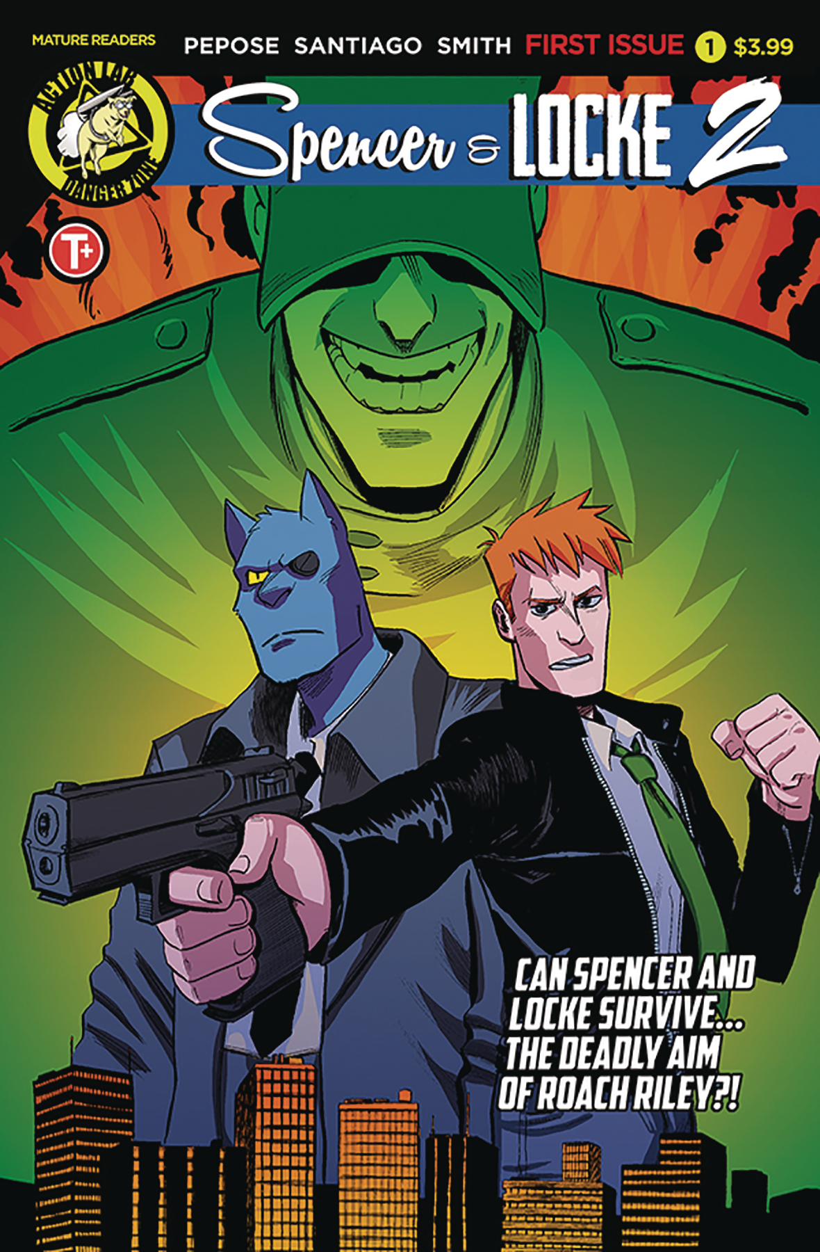
Spencer & Locke, Vol. 2 #1
Writer: David Pepose
Artist: Jorge Santiago, Jr.
Colorist: Jasen Smith
Letterer: Colin Bell
Publisher: Action Lab
Price: $3.99
Release Date: April 24, 2019
Check out Harry Kassen’s recent interview with the creators!
For more comic book reviews, check out our review archives.
Zack Quaintance is a tech reporter by day and freelance writer by night/weekend. He Tweets compulsively about storytelling and comics as BatmansBookcase.

