REVIEW: These Savage Shores #3 is a beautiful comic brimming with big moments

These Savage Shores #3 is out 2/6/2019.

By Zack Quaintance — Through its first two issues, a central question of These Savage Shores has been what it means to be civilized, and whether false notions of civilization have long been used by imperialists to further the economic interests of the powerful. It was right there on the opening page of the first issue, wherein the woman asks the man, And what do I know of civilisation. And the man responds with one of my favorite sentences in any comic in years, I hear it is found beyond the water’s edge on fairer shores, where men die with dignity and learn to live with shame.

This line is A. gorgeous, and B. an incredible mission statement for a book, one so intellectual and noble that it enables writer Ram V., artist Sumit Kumar, colorist Vittoria Astone, and letterer Aditya Bidikar to tell a story about vampires in 2019 that feels literary and profound, no easy feat for a genre that has been plunged into the bawdy and salacious (Twilight, True Blood, etc.). This was a sentiment I returned to often throughout These Savage Shores #3, the idea that the book put in the narrative work through its first two issues to earn the big moments in this particular installment...and there are many big moments in this comic.

They are big moments of a varied nature, too. There is combat, on the battlefield in broad daylight no less, after two straight issues in which violence and conflict was largely confined to lonely streets, to dark jungles, to shadows. There are emotional pleas by endangered rulers to essentially stand up to the imperialism that has loomed over many of the characters since this story’s start (since that couple lay in each other’s arms beneath the hummingbirds and overgrown tree waxing poetic. And there is a cost come due for the death that twisted perceptions of what the rest of the series would be back at the end of the debut chapter.

They are big moments that could suck the narrative air out of less sternly-constructed stories. They have, however, all been earned here. This results in an issue that reads at a lightning pace, that keeps readers like myself who spent December and January returning to this story, blazing through its pages, rapt by the early collisions of ideas and storylines. This is also an issue that lets nobody off the hook. It takes its most powerful character, one of the heroes of the story, and puts him into an unwinnable circumstance, leaving him in a place at issues end that promises to truly show the audience who he is, what he is made of, and how he will handle difficult choices now that what he cares most about the world is being tested against his perception of himself.

To be as direct as possible, this is an absurdly-well written comic by any metric, and as usual the visual storytelling of the art team does it justice, bringing to life the moody lurking threats that are now catapulting their way into the foreground to test the characters and their beliefs. It also can’t be overstated that Kumar and Astone are producing some of the finest artwork in any creator-owned comic today, with richly-detailed linework and colors that oscillate from moody to sultry to frenetic. As letterer, Bidikar is also being called upon to add to the experience and is doing so beautifully with narrative boxes that make clear when certain text is a handwritten letter. Just beautiful beautiful work from all involved.

Overall: Each issue of These Savage Shores has been the best chapter in the story so far, and #3 is no exception. A chapter packed with set pieces and hard-earned big moments, this is a comic that makes me feel unbelievably lucky we have this book. 9.5/10

These Savage Shores #3
Writer:
Ram V.
Artist: Sumit Kumar
Colorist: Vittorio Astone
Letterer: Aditya Bidikar
Publisher: Vault Comics
Price: $3.99

For more comic book reviews, check out our review archives.

Zack Quaintance is a tech reporter by day and freelance writer by night/weekend. He Tweets compulsively about storytelling and comics as BatmansBookcase.


REVIEW: In Amazing Spider-Man #14, Nick Spencer and Chris Bachalo payoff plots from the first issue

Amazing Spider-Man #14 is out 1/30/2019.

By Zack Quaintance — It is perhaps telling of exactly how old I am that to me Chris Bachalo is an artist that reminds me of how comics used to be, which is a phrase I think everyone uses to describe the time they first got into the hobbie. Simply put, Bachalo was huge when I was a new reader, helping to launch Generation X (the start of which was still a few years before my time), before moving over to help with some of the main X-titles, maybe even drawing Uncanny for a while as Grant Morrison and Frank Quitely did their thing on New X-Men.

Anyway, this is all a means to say that Bachalo is an absolutely perfect fit for a fill-in artist on Nick Spencer’s Amazing Spider-Man run, which is playing out holistically as a series as another example of how comics used to be, at least back in my day. This entire issue—from the art to the narrative construction to the use it makes of continuity—really feels like just a bit of a throwback to a different time, as has this run overall. The clearest example of this is that these Amazing Spider-Man comics are pretty clearly not written for trade compilations, not even a little bit.

You can really see it in this issue, which is 14 issues and six months into the run...and just now playing out pretty minor narrative threads that were dropped loosely into the background of Amazing Spider-Man #1, specifically thinking here of Peter’s offer from Conners. Now, not to sound like that old guy, but this is something that was once commonplace, back when stories weren’t conceived in six-issue bursts that should leave it all on the page lest the market dictate a sudden ending.

And the Connors thing isn’t the only bit in this issue drawn from #1. The conflict with Taskmaster and Black Ant was also seeded way back, possibly in the same scene with The Lizard (though I’d have to go back and verify to be certain). This is all well and good, and I like it because it scratches my long-form narrative itch as a reader. I think it’s an especially good thing for a book like Amazing Spider-Man, that publishes every other week. There really isn’t a need to so clearly define story arcs when the next chapter is generally 13 days away when you finish any given issue. The book should flow from plot to plot, carrying with it remnants as it moves into new territory. That’s certainly what Spencer and his artistic collaborators, whether it’s back in the day Chris Bachalo or regular series linework provider Ryan Ottley.

In terms of an individual read, this is a dense one, with multiple narrators, long conversations, and some pretty strong ideas jockeying for position, be it Aunt May’s disgust at her deceased husband’s sleazy accountant, or The Lizard’s son heartbreakingly wanting to just be a regular kid. There are so many emotional beats in this issue that it fades into a cacophony of feelings at times, making it hard for any one to move to the forefront and land with major resonance.

For me as a reader, that’s a great problem to have, especially for a comic I’m paying $8 a month to keep up with.

Overall: A dense issue of Amazing Spider-Man, packed with bits of continuity, big feelings, and payoffs to plot threads that have been dangling since the first issue. This series continues to have a narrative construction that calls back to times when stories weren’t written for trade, and it’s refreshing. 8.4/10

Amazing Spider-Man #14
Writer:
Nick Spencer
Artist: Chris Bachalo
Letterer: VC’s Joe Caramagna
Publisher: Marvel Comics
Price: $3.99

For more comic book reviews, check out our review archives.

Zack Quaintance is a tech reporter by day and freelance writer by night/weekend. He Tweets compulsively about storytelling and comics as BatmansBookcase.

REVIEW: Ice Cream Man #9 changes everything you knew about this book

Ice Cream Man #9 is out 1/30/2019.

By Zack Quaintance — Whoa. This issue was nuts, in the best way, and I’m going to do my best to not tip into spoiler territory here. However, I make no promises. So, if you really want to avoid any and all chance of spoilers, I encourage you to skip to the Overall section of this review down at the bottom for a spoiler-free word about whether you should buy this comic. If you have read Ice Cream Man #9, well friend, strap in, because this is about to get wild.

Ice Cream Man #9 up-ended my perception about the scope of this comic. It also sent me back through all eight of previous issues looking for clues. And you know what I found? Tons of them, along with a new sense of what this book is accomplishing. As I wrote in my review of Ice Cream Man #8, I thought this series was a commentary on instant gratification of the soul, on giving into easy feelings of fear and anxiety versus doing the difficult self work it takes to be optimistic, contented, happy. And it is that, to extent, but it’s also quite a bit more.

Ice Cream Man is a book telling an overarching story despite on its surface largely appearing to be an anthology series, albeit one with light connective tissue. The spider from the first issue here, a cop we vaguely know there, plus the titular Ice Cream Man and his weird enemy cowboy guy. A closer look, however, reveals that all along there has been a battle raging between two ancient polemic forces, one of malicious chaos and another that just wants folks to know we’re all friends, all connected, all just trying to live our peaceful lives.

To tell that story, writer W. Maxwell Prince, artist Martin Morazzo, colorist Chris O’Halloran, and letterer Good Old Neon have tapped almost every unique quality inherent to the monthly comics medium, ranging from the slow nature of the release schedule (used to draw the focus to the vignettes, rather than the forces in the background) to juke readers on the format of the narrative to the lettering, which is shaded white in boxes for the evil monologues and black fro the good. This comic has been a true work of patient serialized art, and now in Ice Cream Man #9, the creators are pulling what this book is really about from the background to center stage. And, to be crass, this sh** is f***ing epic.

I read this issue twice. The first time intrigued but bewildered. Then I went back and browsed previous issues for every appearance of the Ice Cream man, and I read it again. That time, I was absolutely blown away at what the creative team is doing. With that in mind, it is perhaps fitting and intentional that in Ice Cream Man #9 the old man character in this story tells the black-clad cowboy Caleb, End, beginning. It’s all the same, because Ice Cream Man is a comic built with no distinct start or end point. It’s a fluid story that demands repeat readings to really grasp its nature. At least the first eight issues play that way.

This issue pushed me to look back and also forward, seeding questions with every new reveal as if it were the work of David Lynch, who is a pretty clear influence on this whole deal, what with the idea that below the idyllic surface of life is bugs, as well as the counterpoint—we’re all the same and connected—which is rooted in Lynch’s beloved transcendental meditation and its universal field. But I digress and I’m getting long-winded here anyway, so let’s wrap things up...

Overall: The end of the beginning of the beginning of the end. An absolutely mind-wrecking read that suggests a more grandiose story than initially promised. Get past issues of Ice Cream Man nearby, because the creators have built something complex and subtle that will re-wire your perception of this series. 9.8/10

Ice Cream Man #9
Writer:
W. Maxwell Prince
Artist: Martin Morazzo
Colorist: Chris O’Halloran
Letterer: Good Old Neon
Publisher: Image Comics
Price: $3.99

For more comic book reviews, check out our review archives.

Zack Quaintance is a tech reporter by day and freelance writer by night/weekend. He Tweets compulsively about storytelling and comics as BatmansBookcase.
REVIEW: Wyrd #1 is a pastiche of classic comics atop some new truths

Wyrd #1 is out 1/30/2019.

By Zack Quaintance — Dark Horse Comics’ new original series Wyrd is a pastiche of classic comics ideas used to uncover deep truths about country, contentment, and feeling out of place in a harsh world. Wyrd is a dash of Mignola, a healthy serving of the most twisted Captain America you’ve ever seen, and a foundation of a main character whose attitude has more than a little in common with John Constantine from Hellblazer. But in between all the homage, a unique writer’s perspective shows through.

That writer is Curt Pires, and in this comic he spins some of the best writerly dialogue in recent memory. There are nice turns of phrases throughout, usage of prose that would hold its own in grad school level creative writing workshops (as much as any prose ever does in those cruel things). Two examples stuck in my mind most clearly after reading. And I’ll get to them both, but first a brief summation of our plot.

Our main character is Wyrd, a freelance monster hunter/weird shit handler for the U.S. government. In this first installment, we learn that he’s troubled, maybe even suicidal, before seeing him shipped off overseas to hunt a super soldier out of control. It’s a relatively simple story in setup but not in execution. Within this solid framework, Pires and his artistic collaborators Antonio Fuso and Stefano Simeone do some seriously heavy lifting with mood, aesthetic, and tone.

Fuso and Simeone’s artwork gets pretty gruesome at times. I’m not always one to appreciate a violent comic, but I had no issue with the way harsher visual storytelling was deployed here. In other words, the proceedings never tipped into gratuitous or repulsive. There are in-set panels a plenty showing the damage Wyrd incurs as he fights, but all of them are necessary to establish his regenerative abilities (add Wolverine to our pastiche, btw). Simeone’s colors push the visuals a step further, especially in the flashback scenes that use a duller set of shades without deploying the sepia cliches. Wyrd #1 is by design a grizzly and rough-looking comic, and that’s good, it should be.

The forlorn beauty of this book is in its language. Let’s get to those promised bits of writing that really stand out. The first is the monster at one point telling Wyrd, I can see through you. Transparent. You’re a ghost in a man suit. A black hole covering memory. It makes sense in the plot but one also gets the impression that Pires might just feel that way period and is using this as a chance to express it. It’s these little gold coins that lead readers throughout the comic.

The second is the gorgeous soliloquy at the end about the joy and hope a child represents in the world. It’s a subtle moment. I might even call it understated if it didn’t serve as a coda for everything that came before, and I absolutely loved it. Wyrd’s self-destructive drinking and sarcasm would run the risk of feeling too familiar if it wasn’t bookended with the poignant reason for his discontent. A great decision by the storytellers that sets up a fascinating series moving forward.

Overall: Wyrd #1 is one part deep comics pastiche and one part introspective look at a troubled man, likely at a point in his (too long) life where he’s lost any belief in the systems. This is a solidly-constructed comic that might just grow into something really special. 8.2/10

Wyrd #1
Writer:
Curt Pires
Artist: Antonio Fuso
Colorist: Stefano Simeone
Letterer: Micah Meyers
Publisher: Dark Horse Comics
Price: $3.99

For more comic book reviews, check out our review archives.

Zack Quaintance is a tech reporter by day and freelance writer by night/weekend. He Tweets compulsively about storytelling and comics as BatmansBookcase.

REVIEW: Peter Cannon Thunderbolt #1 is a superhero romp with a provocative end

Peter Cannon: Thunderbolt #1 is out 1/30/2019.

By Zack Quaintance — If you do not follow my instructions precisely, this planet will be dead before the day is out...but the task is not impossible. This is a mission statement for the comic and also a telling look into the personality and capabilities of the the protagonist—Peter Cannon: Thunderbolt. Which is all well and good for a reader like me, who is only vaguely aware that the character has a long history (dating back to 1966, turns out), created by legendary comic book writer/artist Pete Morisi for oddball Charlton Comics. Incidentally, as interested as I am in the history of DC Comics, I did not know the character had ever cropped up there, but he has. I did know he was the inspiration for Watchmen’s Ozymandias, which will come into conversation later, but I digress...

So, what’s up with this new Peter Cannon: Thunderbolt comic book then? Well, it certainly has the right creative team, or at least one that I’d deemed A List. Kieron Gillen is one of the bigger names in monthly comic book writing, having worked on a number of beloved runs at Marvel Comics as well as notable creator-owned books liked The Wicked + The Divine and, most recently, Die (which rules, btw). Providing the art is Casper Wijngaard of the severely under-appreciated creator-owned comic, Limbo, and his work is brought to such vivid life here by colorist Mary Safro.

This is, indeed, a very visual comic book, which sounds odd to say about a medium that’s always very visual, but it’s true: this book brims with gorgeous splash panels, drawn by Wijngaard and Safro. In fact, more than any of Gillen’s other recent new books—his work on Star Wars, Die—it feels like he spends much of this comic trying to get out of the way here, letting the visuals carry readers through the rudimentary stuff, the introductions to the world, the people, the threat it faces, and the way Cannon is almost immediately able to concoct a solution.

Gillen really makes his presence felt at the end, however, when he shows his hand and unveils the conceit of this comic: this book borrows pretty directly from the plot of Watchmen in some really crucial ways. Not to go too far into spoiler territory, but both the reason the threat has come to Earth and the person who sent are essentially right out of the pages of Alan Moore and Dave Gibbons’ seminal comic. This has been a controversial artistic move in the past when done by the property’s actual corporate owners, DC Comics, but I imagine (relatively) small fry dynamite and indie comics good will hoarders like Gillen and Wijngaard will be given the leeway to tell an intriguing story with this concept. Besides, Ozymandias himself was essentially borrowed IP from the original Peter Cannon: Thunderbolt, which sends my mind down an infinite rabbit hole just thinking about it.

Overall: A pithy and entertaining read with some nice throwaway commentary for much of its duration, the real promise and potential of this comic becomes clear in its final pages. For long-time students of comics as well as recent die hards who’ve looked back even a bit, I highly recommend giving this debut issue a shot. 9.2/10

Peter Cannon: Thunderbolt #1
Writer:
Kieron Gillen
Artist: Casper Wijngaard
Colorist: Mary Safro
Letterer: Hassan Otsmane-Elhaou

For more comic book reviews, check out our review archives.

Zack Quaintance is a tech reporter by day and freelance writer by night/weekend. He Tweets compulsively about storytelling and comics as BatmansBookcase.


REVIEW: Guardians of the Galaxy by Donny Cates and Geoff Shaw is Marvel’s best new #1 in recent memory

Guardians of the Galaxy #1 is out 1/23/2019.

By Zack Quaintance — There is a special alchemy in (semi-) monthly comics between certain writers and certain artists, a working relationship that takes hold and helps the members of a team feed off each other’s work, rising through the industry and earning new fans together. I could list examples, but you probably have your own favorites in mind as you read this. I know I’m thinking of mine, and rarely have I seen a team entrench itself as quickly among my personal favorites as Donny Cates and Geoff Shaw.

I know they’d worked together previously on The Paybacks (a well-regarded comic that I’ve been meaning to read for a while now but just haven’t...sorry), but my own first exposure to both of them was God Country #1. Released in January 2017, the creator-owned book through Image Comics was a tour de force of good vs. evil, inter-dimensional sword fighting, and Texas braggadocio and swagger. The book found an audience, quickly, setting both of its creators on the path that has lead them to us today, two years later, doing Guardians of the Galaxy #1 for Marvel (in between, they also made one of my personal favorite recent Marvel runs, Thanos WIns).

If ever there were a franchise in need of some new excitement, it’s Guardians of the Galaxy. It’s been a few years since the team had a memorable comics run, owing to some chaos in the Marvel line (they’ve gotten a new E-I-C) and a sort of backseat for the company’s cosmic properties. The Guardians of the Galaxy physical comics have also suffered a bit from being too-specifically tailored to match the lineup in the movie.

Since that film came out in 2014, we’ve basically been getting lineups that feature all the characters from the movie...plus Venom; or all the characters from the movie...plus The Thing, etc. It was a way to try and offer comics fans something new without really deviating to an unfamiliar place for the presumed new fans of the movie, who could be seeking the comic. The result was a book that felt hamstrung by its own status quo, which is never a good thing but is especially bad for cosmic-set comics where exploration, discovery, and literally out-of-this-world surprises are a currency.

Today’s Guardians of the Galaxy #1, however, is just about as good of an injection of new excitement as I can imagine for this team. As we’ve come to expect from the duo, it’s a fantastically-executed comic, one that uses Shaw’s propensity for big moments of chaos and destruction to great effect. Cates is also evolving as a writer here, with nary a sign of the omniscient Texas-voiced narrator that has driven much of his best work. It’s a great thing to see, two young rising creators at the tops of their game relaxing into a story.

The concept for this new run is also strong, in that it grows directly from my personal favorite Cates story, Thanos Wins. It’s very much a Guardians of the Galaxy book (the presence of Peter Quill and Groot sees to that), but the problems the new team seems destined to face stem from the events of the earlier story, creating multiple mysteries (always a good thing) as well as fearsome inter-galactic threats. Simply put, this is the type of streamlining that justifies a Big 2 superhero #1 issue and reboot, and I can’t wait to see where the creators take it.

Overall: The first exciting new chapter for the Guardians in I don’t know how long, Guardians of the Galaxy #1 sees two of Marvel’s best young creators operating with giant ambitions, and they absolutely deliver. This is a big story, one worthy of involving the entire galaxy. 9.5/10

Guardians of the Galaxy #1
Writer:
Donny Cates
Artist: Geoff Shaw
Colorist: Marte Gracia
Letterer: VC’s Cory Petit
Publisher:
Marvel Comics
Price: $4.99

Check out some of other thoughts about this comic from both this week and the past in our reviews archive.

Zack Quaintance is a tech reporter by day and freelance writer by night/weekend. He Tweets compulsively about storytelling and comics as
BatmansBookcase.


REVIEW: Tom King’s Batman #63 enlists Mikal Janin for Bat-Cat wedding redux

Batman #63 is out 1/23/2019.

By Zack Quaintance — There’s a very familiar feeling to the start of Tom King’s Batman #63. Mikel Janin, King’s primary collaborator from July’s infamous Batman #50 Bat-Cat wedding issue, is back providing the artwork. Moreover, what’s actually happening on the page is familiar too. Bruce is on a rooftop in a tuxedo as the sun comes up, just as he was during the wedding, flanked by Alfred and a tipsy officiant. There’s a quick cut to the goodbye letter Catwoman left on his pillow, and then our hero steps to the edge of the building prepared to jump off...we’ve seen all this before.

Before he can go fully over this time, things begin to change. This time Catwoman is there, telling him to wait. This time things are different, better—until they suddenly aren’t. Thus is the premise of Batman #63, the third part of the ongoing Knightmares story arc for this title (and before you protest about spoilers, everything I just described happens on the first page of this very compressed issue, which is an idea we’ll return to a bit later...).   

Knighmares continues to be an arc of unreality. Readers don’t know what’s real and what’s not. The last issue saw Batman battling Professor Pyg, who at the very end removed his mask to reveal himself as Damian Wayne, Bruce’s estranged son and Robin. Essentially, Batman #61 planted the seeds that Batman was trapped in some sort of hallucination via the Bruce Wayne murder kid character (which I’m pretty ambivalent about, but that’s another thing all together…), Batman #62 confirmed it, and now Batman #63 builds on the concept further, doing so by replaying what so far has been the headling moment of Tom King’s Batman run—the wedding.

I won’t go too far into specifics, but this issue uses John Constantine as a mechanism for both tormenting Bruce (telling him this happiness is fleeting) and giving some narrative clarity to the reader. Constantine (whose own reality we are left to wonder about for most of the proceedings) keeps telling Bruce what we pretty much know, that this is all fake and will end badly. This is all setup in the start, and I don’t want to go too far into the plot what happens. What I do want to talk about, however, is whether this issue and this larger arc is good.

Let’s look at where the arc started, or, to be more precise, what it started after. In Batman #60 Alfred is assaulted in the Batcave by Thomas Wayne, Flashpoint Batman, who we knew was in this reality and assisting Bane from the last panel of Batman #50. He also gets the jump on Bruce, leaving us to wonder what happens next. What does happen next? Well, we’re plunged into the fakery of Batman #60. In some ways, this arc is one meant to stall, to keep us wondering what’s up with the Flashpoint Batman without giving us too many answers.

In other ways, it’s meant to give the creators a chance to delve further into the psyche and humanity of Batman, which is what this run has been about from its very first issue. King knows that cliffhanger has fans on the hook, and now he’s basically saying let’s slow down (in entertaining and relevant ways) to look at the emotional effect on our hero. King has done this previously with other lesser-known superhero characters, mainly Mister Miracle and The Vision. Mister Miracle in particular played with perceptions of reality, with a case to be made that any action in any of was happening entirely in Scott Free’s head.

Given the prominence of the character, King doesn’t seem to have (or maybe want) that same luxury with The Bat. As such, he ends up giving us more compress Knightmares (as it were) and tipping his hand sooner. Does it work? I absolutely think it does, and on the whole I enjoyed this issue and its functions within both the longer story arc and run. Basically, a little bit a clarity about what’s actually happen goes a long way, bringing what the writer is trying to do into focus and engendering us with the trust and patience we need to stick with it. This lack of clarity, in my opinion, has hurt portions of a couple of other recent Tom King comics: the ending of Mister Miracle and the beginning of Heroes in Crisis.

Someone like David Lynch might get all the rope in the world to confuse the daylights out of us, but David Lynch is making arthouse cinema. In superhero comics, it’s almost always the case that writers most artful form-bending inclinations are best served by being reduced just a bit in the service of accessibility. It’s like if you were baking a cake—experiment with ingredients all you want, but you’re still going to need the sponge and taste and texture that make what you set out to do recognizable. I think Batman #63 most certainly delivers in that regard.

One last note: I think Tom King’s voice and stylistic flourishes work better with some characters than with others...Constantine is without question a good fit for King, and I’m suddenly intrigued to read more of his work featuring this character, even if it’s just a cameo here or there.

Overall: A little bit of clarity about what’s really happening goes a long way in Batman #63 mixing with the Bat-Cat wedding redux motif to result in the strongest issue of this arc so far. Also, Mikel Janin’s impeccably-clean linework is always welcome on this title. 8.5/10

Batman #63
Writer:
Tom King
Artist: Mikel Janin
Colorist: Jordie Bellaire
Letterer: Clayton Cowles
Publisher: DC Comics
Price: $3.99

For more comic book reviews, check out our review archives.

Zack Quaintance is a tech reporter by day and freelance writer by night/weekend. He Tweets compulsively about storytelling and comics as
BatmansBookcase.

REVIEW: Livewire #2 continues to establish this run as a must-read superhero comic

Livewire #2 is out 1/23/2019.

By Zack Quaintance — A key theme in Livewire #1 was whether one can justify extreme actions just because they have a righteous and worthy cause, and it manifested clearest in an argument toward the end between Amanda (aka Livewire) and Avi, an argument about her actions during the Harbinger Wars 2 event, during which she shut down the entire country’s power grid to stop shady government actors from murdering/abusing Psiots but in the process caused loss of life, resources, and safety.

Writer Vita Ayala’s script for the debut issue played this all out across the tricky philosophical ground the ideas call for, not letting anyone involved off the hook. This gave the series’ debut (and by extension the series moving forward) a dynamic, realistic feel. At one point, Avi even laid it all there, asking Amanda, “‘By any means necessary,’ right?”

More plot went down, and the first issue eventually ended with Amanda in a precarious position, seemingly caught by a squad of elite forces. During the capture, the commandos go out of their way to assure her they are motivated by good sense (she has a massive bounty on her head) and are far from the most extreme folks hunting her. It was a nigh-perfect ending, leaving readers with a sense/fear that Amanda was about to suffer consequences for what she’d done, potentially even in a way that would rattle the surety of her justifications.

Speaking of which...justifications, good intentions, right versus wrong, means versus the end, regret—that first issue had hints of it all, leading to a great hook for a series that already feels both promising and powerful (even if it is steeped in some immediate back continuity from the larger Valiant superhero universe). I, however, read an advanced copy of the issue in either late November or early December, and almost immediately regretted doing so because it meant that I wouldn’t get to resume this story for many weeks. Anyway, here we are now with Livewire #2.

What I found most impressive is the way it naturally evolves from its earlier focus on Livewire’s consequences, to the extreme actors on the other end, essentially putting her in the clutches of those she made her drastic move to save children from. And what do we find once she’s there? An infrastructure of abuse, fear, and weaponized bigotry that is well fortified, it was clearly in motion (although they insist it was not) long before she did what she did.

I don’t want to spoil any of the particulars, but I will note this excellent bit of dialogue, wherein Livewire tells her captors, Things like these are exactly what led me to the shut down. People like you made the fight necessary. It’s 2019, and I think most (if not every last one of us) has felt the need to say some variation of this in the last two or three years, perhaps often.

In a broader sense, this is just an incredibly smart comic. Stories about Valiant’s Psiot characters, is that they’re all built on ideas derivative from X-Men. The best of them (and this early Livewire book is quickly making a case to be among those, up there with Joshua Dysart’s and other writers’ Harbinger and Toyo Harada books) extrapolate the ideas and metaphors from X-Men to more complex and consequential places, places the commercial interests of the larger Marvel franchise often prevent them from going. When someone threatens to negate Livewire’s powers with an experimental surgery, for example, there’s a sense it might actually happen, which just isn’t the case with Nightcrawler, Colossus, or Kitty Pryde, and so on.

I could keep going, but the point is there’s just so much to like about this comic. This is really Valiant superhero stories at its best, smartly written, impeccably illustrated, and done with a sense that anything can happen if it serves the story. I highly recommend getting in on this series.

Some other quick highlights from issue #2: great word play equating false profits with false prophets; the opening fight sequence by Raul Allen and Patricia Martin is absolutely electric; the color work in the cell; and the excellent panel wherein Livewire starts to fight back against impossible adds, the one that stands as an homage to the famous We Can Do It! World War II poster.

Overall: Livewire #2 picks up where the previous installment left off. The creative team here is really building something special, and I can’t emphasize strong enough that fans of superhero fiction should get in on the bottom level. This comic has the potential to be a run talked about for a long while. 9.5/10

Livewire #2
Writer:
Vita Ayala
Artists: Raul Allen and Patricia Martin
Letterer: Saida Temofonte
Publisher: Valiant Entertainment
Price: $3.99

Check out some of other thoughts about this comic from both this week and the past in our reviews archive.

Zack Quaintance is a tech reporter by day and freelance writer by night/weekend. He Tweets compulsively about storytelling and comics as BatmansBookcase.

REVIEW: Oliver #1 is a strong comic that maybe doesn’t need to reference Charles Dickens

Oliver #1 is out 1/23/2019.

Oliver #1 is out 1/23/2019.

By Zack Quaintance — An old rule in print journalism says that if you can find three instances of something, well then, you’ve got yourself a trend. You can then go ahead and write a story about athletes training with kettlebells, or people living on all egg diets, or gluten-free being the new Atkin’s (these are all actual trend stories I wrote during a brief period as a features reporter at a newspaper in South Texas). In comics in the last year, we’ve had two modern/futurist re-imaginings of the Charles Dickens’ classic Oliver Twist. All I’m saying is if someone can put out one more, we’ll officially have ourselves a trend.

That said, I’ve liked both Oliver Twist-inspired comics so far to varying degrees. The first came out last year from Dark Horse Comics’ Berger Books imprint, an often-literary minded group of titles curated by ex DC/Vertigo editor Karen Berger. That series was Olivia Twist from writers Darin Strauss and Adam Dalva, with artist Emma Vieceli. It’s mostly fine, if a little safe with its plotting for my tastes. The second variation of this idea (out this week) is Oliver #1 from Image Comics, courtesy of a well-seasoned creative team: writer Gary Whitta (who has screenwriting credits on Star Wars: Rogue One and The Book of Eli) and artist Darick Robertson, of Transmetropolitan fame.

There are two relevant ways to evaluate these titles, the first being through the lens of a comics reader entirely unfamiliar with Oliver Twist, and the second as someone excited about a story that relates to the literary classic. This is a review of Oliver #1, so obviously we’ll focus our attention there. That comic, in my opinion, will work quite well for a reader who has absolutely no familiarity with (nor interest in) Oliver Twist. I’ve read the Dickens’ novel, for what it’s worth, but I still felt throughout that even if I hadn’t, this would have been a compelling comic, one that relies more on ideas about dystopian futures (all the rage in 2019) than it does on paying homage or connecting to the source material.

That brings me to the second point which gives rise to this question: is the connection to the Dickens’ work additive for this comic, or is it just a simple point from which to hang a new IP pitch? I must admit, I found myself wondering at times if this was conceived as an Oliver Twist homage, or if during the creative process similarities were pointed out, leading to the connective tissue to that work being reverse engineered. To be fair, there is an interesting in-plot reason for the connection, and ultimately, I’m not sure it even matters...I just think in this debut issue the whole futuristic Oliver Twist tagline might prove a bit distracting for what is otherwise a very good comic.

Which brings us to the last (and arguably most important) point I’d like to make in this review: the reasons this is a very good comic. My favorite aspect is Robertson’s artwork. As noted, he was the artist behind Warren Ellis’ seminal late ‘90s series, Transmetropolitan. One of the things I liked most about this comic was the rendering of the dystopian landscape. There are hints of Robertson’s previous work, but this without question feels like an update, a grittier (if such a thing is possible) and more familiar vision of life after the end of the world. Whitta, meanwhile, does an admirable job with pacing in a new (to him, I believe) medium, while also putting an orphan-protector relationship at the heart of this story that speaks to questions about our own responsibilities toward both our planet’s future and to youth who may be quite different from us, as well as the obligatory dystopian commentary about war and the military industrial complex. I liked it all, though, and as such, I will not artfully dodge (jesus) out of this book before its second issue.

Overall: A solid debut issue wherein Darick Robertson, a seasoned veteran of dystopian comics, continues to push his artful rendering of blown-out landscapes. What’s also compelling about this comic is the orphan-mentor relationship screenwriter Gary Whitta situates at its core. The Oliver Twist connection is perhaps a bit superfluous, but this is otherwise a strong comic. 8.3/10

Oliver #1
Writer:
Gary Whitta
Artist: Darick Robertson
Colorist: Diego Rodriguez
Letterer: Simon Bowland
Publisher: Image Comics
Price: $3.99

For more comic book reviews, check out our review archives.

Zack Quaintance is a tech reporter by day and freelance writer by night/weekend. He Tweets compulsively about storytelling and comics as BatmansBookcase.

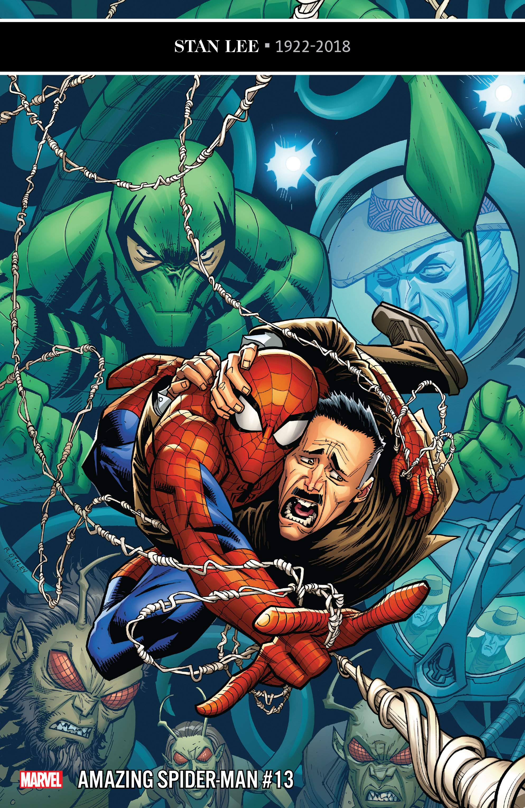
REVIEW: Amazing Spider-Man #13 ends Jameson story arc with growth, emotional honesty

Amazing Spider-Man #13 is out 1/16/2019.

Amazing Spider-Man #13 is out 1/16/2019.

By Zack Quaintance — Amazing Spider-Man #13 continues an interesting trend I’ve noticed throughout this young: it continues to take Spider-Man continuity deep dives and translate them into new stories. This is not all that novel of an approach for stories about decades-old characters. It is perhaps a bit less common at Marvel (where characters are generally a bit younger), but over at the distinguished competition, writers like Geoff Johns and Grant Morrison have told some of our best modern comic stories by plumbing the continuity depths and teasing old ideas, concepts, principals to the surface.

That notion is one that’s been evident multiple times throughout Nick Spencer and Ryan Ottley’s still-nascent Amazing Spider-Man run and is evident yet again this week with Amazing Spider-Man #13. In this issue, the big bad who’s been tormenting both Spider-Man and his foil-turned-friend J. Jonah Jameson since issue #11 is revealed to be Frederick Foswell...Jr., who is the son of Frederick Foswell, Sr., a Daily Bugle reporter who once nearly pulled off a successful investigation of Spider-Man’s true identity before becoming way too close to his sources and ending up as a crime boss.  

Indeed, Foswell made his first appearance all the way back in Amazing Spider-Man #10 (1964), created by Stan Lee and Steve Ditko themselves. Like many characters, Foswell has popped up here and there through the years, most recently in previous writer Dan Slott’s Dead No More: The Clone Conspiracy storyline, having his evil Big Man alias in story as a clone. This issue, however, takes his life and death a bit more seriously than prior appearances, having his son return to get revenge on Spider-Man, motivated as he is by J. Jonah Jameson’s now-gone hatred for the hero.

And you know what? I really liked all of that. It was a nifty way to accomplish the dual feats of A. giving Spider-Man a relevant foe to battle for a few issues, and B. continuing Jameson’s growth arc and transition from Spider-Man hater to someone who’s now seen the error of his ways. Heck, in this issue Jameson publicly admits to having been a bad journalist for all those years. For long-time Spidey fans and readers this is no small thing. It won’t garner the headlines the same way something like giving Aunt May cancer does (see Friendly Neighborhood Spider-Man #1), but from a character growth standpoint it’s really much more impactful and rewarding to careful readers, to all of us who have rolled our eyes at Jameson so thoroughly eviscerating Spider-Man’s public image no matter how heroic he proves himself to be.

I know for me—a nigh life-long Spiderman fan and a professional journalist by trade—I’ve found his constant inflammatory editorializing frustrating as all get out. To see him grow away from that (even at personal cost for himself) was just so much more compelling than killing or maiming the character. And so far, that’s really what’s marked this run: characters moving at deliberate pace towards moments of growth and emotional honesty. Pepper in some of Spencer’s pithy humor and a seemingly-irrepressible desire to use every last Spider-Man villain ever, and this continues to be a fantastic run for Marvel’s flagship character.

Overall: Amazing Spider-Man #13 doubles down on two of the strengths of this run: deep and serious dives into Spider-Man’s long continuity, and finales that deal more with emotional honesty and growth than they do with punching and kicking. This time it’s J. Jonah Jameson’s turn to be a better man, and the result is a thoroughly enjoyable Spider-Man comic. 8.8/10

Amazing Spider-Man #13
Writer:
Nick Spencer
Penciler: Ryan Ottley
Inker: Cliff Rathburn
Colorists: Laura Martin and Andrew Crossley
Letterer: VC’s Joe Caramagna
Publisher: Marvel Comics
Price: $3.99

For more comic book reviews, check out our review archives.

Zack Quaintance is a tech reporter by day and freelance writer by night/weekend. He Tweets compulsively about storytelling and comics as BatmansBookcase.

REVIEW: Electric Warriors #3 features killer pivot for refreshing mini-series

Electric Warriors #3 is out 1/16/2019.

By Zack Quaintance — Electric Warriors #3 is a surprising comic, which is entirely in keeping with how this book has been since its start. I found it to be somewhat of a surprise when it was announced by DC just prior to this year’s San Diego Comic Con. With the publisher in recent years mostly playing it safe with series (aside from the ill-fated New Age of Heroes line, which it pretty clearly got cold feet over before it even launched). Electric Warriors, however, was an original idea set in an under-utilized era of DC continuity—Earth post Jack Kirby’s Great Disaster but pre Legion of Superheroes.

So, yes, I was surprised from the moment this book came into existence. I was not, however, surprised at the excellent story writer Steve Orlando and artist Travel Foreman started telling. There was rich commentary about Earth and its divisive ways, a compelling familial imposter sub-plot, and all kinds of nods to obscure characters, alien races, and concepts from old DC Comics. The plot trajectory seemed pretty straight forward: the two champions of Earth would come apart before coming together and realizing it’s all one planet and as such we should all be one people (thereby making an excellent statement about the current divisive politics sweeping the planet and fueling the rise of authoritarian governments).

In Electric Warriors #3 the trajectory I had envisioned changed. A lot. I won’t go into spoiler territory, but just know that this book is probably not what you first expected it to be. It may still arrive at the lesson I mentioned above (in fact, I for one am betting on it), but it seems to be taking a wholly unexpected (and delightfully more complex) path to get there, one filled with suspense and surprises.

Indeed, at the halfway point for this six-issue mini-series a picture has emerged of a tight and clean narrative with a lot to offer both casual and long-time DC Comics readers. Orlando is really at his best here, equal parts brutal in the action and thoughtful with the characters and twists. Travel Foreman, of course, is an other-worldly imaginative talent clearly reveling in the freedom being afforded to him by playing in an obscure Big 2 timeline and era.

I don’t think I’ve heard nearly enough chatter about this book, but it really is something special...and refreshing, an original concept from a Big 2 publisher, filled with new characters who can change, and learn, and grow, and ultimately die. It’s not too late to jump onto this train. At the very least though, I highly recommend making a mental note right now to catch up on this book in trade. Here’s hoping it factors into (or, even better, helps pave the way) toward whatever Brian Michael Bendis is currently gearing up to do with the Legion of Superheroes.

Overall: The only things more imaginative and brutal than the action on the page here are the twists in the plot. A surprising turn in Electric Warriors #3 has me seeing this already-solid comic in a new and more complex light. If you’re not reading this book, you can’t complain that the Big 2 don’t try enough new ideas. Get on it. 9.2/10

Electric Warriors #3
Writer:
Steve Orlando
Artist: Travel Foreman
Colorist: Hi-Fi
Letterer: Travis Lanham
Publisher: DC Comics
Price: $3.99

For more comic book reviews, check out our review archives.

Zack Quaintance is a tech reporter by day and freelance writer by night/weekend. He Tweets compulsively about storytelling and comics as
BatmansBookcase.

REVIEW: Babyteeth #14 is contemplative AND hilarious

Babyteeth #14 is out 1/16/2019.

By Zack Quaintance — Babyteeth #14 marks the return of one of AfterShock’s best comics. This series wasn’t on a hiatus. No, it’s last issue came out in late October. Factor in the crowded holiday season (those dreaded times when commitments other than comics rear their heads), and the book’s short break felt more like an extended skip month. Either way, the book is back now, and you know what? It’s as sharp as it's ever been.

What’s perhaps most noticeable is the humor in this issue’s script. Basically, after a two-month hiatus, Babyteeth is back, and so is writer Donny Cates, at his most hilarious and absurd. This is the clever, pithy scripting that Cates used to announce his arrival at Marvel so emphatically in late 2017 with his work on Doctor Strange and Thanos Wins. It’s the dialogue that sounds like a mix of films by Richard Linklater and Adam McKay, conversational in a lazy Texas sort of way but never far from a slapstick and hilarious one-liner.

And Cates puts that humor to great effect here as we finally meet the McGuffin of this story, satan, giving him a number of one liners that made me chuckle aloud, which is pretty rare for me to do when I’m reading a comic. He’s not the only one being funny here, though. Artists Garry Brown and Mark Englert get called on to draw a very late painting by Vincent Van Gogh, and they come back with an image that’s just perfect...disturbing in an absurd way, like something from a raunchier version of Beetlejuice.

All the jokes, however, are sort of a trojan horse for something much deeper: a contemplation of mankind’s perceptions of satan and god, which is then extended into a look at the very nature of good and evil, and how from a certain point of view it’s nigh impossible to tell which is which. And look...I know, I know...my hackles are up just writing that, but it’s not some kind of veiled diatribe about the media or fake news or something hackneyed like that.

Cates and the Babyteeth team have a deep biblical interest. They aren’t saying anything here about how the last Tweet you sent could be construed as both supportive and critical of whatever issue of the hour. This is a comic that after 14 issues is finding new thematic ground exploring the validity of some of society’s deep abiding perceptions about morality as shaped by our ideas of the being that created us.

And look, I know what we’re talking about here: a comic called Babyteeth that in the first issue probably (I forget) had a scene where the baby spit up and it caused an earthquake, or locust to fall from the sky or something. This isn’t Chaucer. It’s more fun than all that, and Cates know it. That doesn’t mean he’s not going to try to find some truth during the big goofy party. He is, after all, pretty great at that: see Thanos Wins and the Cosmic Ghost Rider character everyone loves so much, and see God Country, another comic in which his main writerly interests—Texas, theology, and badassery—work well in (very awesome) concert.   

Overall: An alternately hilarious and deep comic, Babyteeth #14 makes the best use of this comic’s concept yet. It’s filled with self-aware horror tropes that dance around real pathos and theology, and everyone involved is clearly having a blast with all of it. 8.5/10

Babyteeth #14
Writer:
Donny Cates
Artist: Garry Brown
Colorist: Mark Englert
Letterer: Taylor Esposito
Publisher: AfterShock Comics
Price: $3.99

For more comic book reviews, check out our review archives.

Zack Quaintance is a tech reporter by day and freelance writer by night/weekend. He Tweets compulsively about storytelling and comics as BatmansBookcase.

REVIEW: Isola #6 is the return of a great series

Isola #6 is out 1/16/2019.

Isola #6 is out 1/16/2019.

By Zack Quaintance —  Isola is one of Image’s most interesting comics, in that it stands out for being both utterly beautiful and massively decompressed (see The Warning). The thing I find most intriguing about Isola, however, is that as the book gorgeously reveals more of what’s happening, why things are happening, who are these characters, and the histories they share with one another, it doesn’t lose much (if any) of its tension.

There’s a concept in fiction I think about often called the rate of revelation, which says that one way to create suspense in a story is to carefully dole out vital information at a certain pace as the plot goes on. This, I believe, is the main strength of Brenden Fletcher and Karl Kerschl’s writing in Isola. They also do a great job of giving the audience what they need to make key orienting assumptions before truths become clear. One early instance of this is how in the first issue the tiger is treated with reverence and called Your majesty. My immediate guess was that a monarch had been converted into a tiger...and I was hell bent on continuing to read until I found out whether I was right.

The other (and more evident/impressive) strength of this comic is what is arguably industry-best semi-regular art. I mean, just look at this screen grab from Isola #5.

The artwork (by Karl Karl Kerschl and Msassyk) in Isola is among the best being done in comics today. Above panel is from Isola #5.

But, friends, we are not here to talk Isola #5! Nor are we here to continue to discussing this comic in a super broad sense. We are, in fact here, to talk Isola #6, which marks a return after a hiatus and the start of the book’s second proper story arc (the Isola Vol. 1 trade is out now, btw, and as I wrote in our Top Comics to Buy for January 16, it’s one of those reasonably priced introductory Image ones, which means with $10 and a little more than an hour you can get all caught up on this fantastic comic…). And it’s quite a solid return, to be sure.

When we last left our two main protagonists—Olwyn, the tiger who wouldbe/is queen; and Captain Rook, charged with escorting her to a possibly magical place called Isola that also might be bad and could maybe not exist—they were encamped under a tarp in the rain after an ordeal that almost claimed the life of the queen. This issue is characteristically decompressed, dedicating its first seven pages (nearly ⅓ of the total) to a slow vision in which Olwyn interacts with her mother. It’s gorgeous, cut with the dreamlike blue hues that marked the last issue’s desperate end, and it also does some work in the plot, leaving me (at least) with a couple of key questions.

The first is maybe more obvious: what role did Olwyn’s family—her parents and erratic brother—play in her current danger and plight, and secondly, what is happening with the animals in this story, are they all as the queen humans banished (or escaped) into other forms? It’s a great question to raise, one that really has me engrossed in what’s happening in these pages. The other significant developments here are that we see yet again that the queen’s forces pose a threat to her and are also erroneously marching toward war in her name, and, perhaps more importantly, a small friend of Rook’s learns what’s going on. The plot, however, is less important than pointing out that Isola maintains the beautiful aesthetic and patient storytelling with ample revelats that have made its first volume such a joy. I’m pretty glad this comic is back.

Overall: Isola #6 is yet another gorgeous burst of sequential art from this creative team, more of the developing fantasy tale with its themes of loyalty, desperation, trust. This is the first issue back after hiatus, starting a new arc. I’m loving this title, and I encourage any with even mild interest to pick up this issue along with the $9.99 first volume Image trade. 8.5/10
Isola #6
Writers:
Brenden Fletcher / Karl Kerschl
Artists: Karl Kerschl / Msassyk
Letterer: Aditya Bidikar
Publisher: Image Comics
Price: $3.99

For more comic book reviews, check out our review archives.

Zack Quaintance is a tech reporter by day and freelance writer by night/weekend. He Tweets compulsively about storytelling and comics as BatmansBookcase.

REVIEW: Friendly Neighborhood Spider-Man #1 is a quieter Spidey book with big implications for SPOILER

Friendly Neighborhood Spider-Man #1 is out 1/9/2019.

By Zack Quaintance — I am generally opposed to comics like Friendly Neighborhood Spider-Man, a fourth Spidey title that takes its place in line behind the flagship Amazing Spider-Man, the rising and youthful Miles Morales: Spider-Man, the intriguing prestige Spider-Man: A Life Story (a six-issue mini about what it would have been like had Spider-Man aged from his creation in real-time), and the perpetual runner-up book, Spectacular Spider-Man. I know there are super fans out there who just can’t get enough of the character, but I find it all just a little much.

In fact, in all likelihood I’d have probably have skipped this book if it wasn’t written by Tom Taylor, who has a shining history of taking a little much ideas like this one and turning them into absolute gold (see Injustice, see X-Men: Red). The concept here is based around a hyper-local take on Peter Parker and his heroics, and the plot of this debut issue sees him literally tending to the troubles of his actual physical neighbors.

The main story in this comic (illustrated with clean adequacy by Juan Cabal) is totally fine. It’s not flashy and it’s mildly intriguing, featuring a nifty little mystery. There are some good jokes, and the book seems to go out of its way to let readers know its complimentary to Amazing Spider-Man, incorporating all the recent minor status quo shifts we’ve seen in that title. The latter is a really nice touch that a long-time superhero reader like myself appreciates. Nothing takes me out of a story more than when an auxiliary title for a Spider, Bat, X, or Superman title just outright ignores the status quo elsewhere in the line. It’s to Friendly Neighborhood Spider-Man’s credit that it doesn’t do this.

WARNING: POTENTIAL SPOILERS BELOW

There are also some nice character moments here, showcasing Peter Parker as a micro-scale humanitarian, but they are nothing we haven’t seen before and seen often. What is likely to really get fans talking is the backup story, which is focused on and narrated by Peter’s Aunt May, iconic Aunt May. I don’t typically make a practice of revealing plot points in these reviews, but it’s hard to discuss this comic without doing so here. The backup story exists pretty much entirely to reveal that Aunt May is suffering from cancer.

This narrative weight is a good case for the book to make for its very existence, if a little unconvincing. I could be wrong, but it seems doubtful to me that a character as iconic as Aunt May would face any real danger in the pages of the third (or arguably fourth or fifth) most prominent Spider-Man title. In fact, in this day and age, I’d only really be convinced if one of these books was headed for a line-wide event or a milestone issue. Still, Tom Taylor is a powerful writer with a big heart, and, while I doubt Aunt May is in any real danger, I trust him to tell stories with this point that intrigue and satisfy on an emotional level.

Overall: In a quiet and polished debut, Friendly Neighborhood Spider-Man #1 does just enough to justify an addition to the Spidey line. A major development for a long-time character also happens in the backup story. It remains to be seen if this title will feel worthwhile moving forward, but Tom Taylor has done great things with lesser concepts, so for now I’m sticking with it. 7.0/10

Friendly Neighborhood Spider-Man #1
Writer:
Tom Taylor
Artist: Juan Cabal
Colorist: Nolan Woodward
Letterer: VC’s Travis Lanham
Publisher: Marvel Comics
Price: $4.99
*Full credits aren’t clear for the backup, but the editor notes the team included Marcelo Ferreira, Robert Poggi, and Jim Campbell.

For more comic book reviews, check out our review archives.

Zack Quaintance is a tech reporter by day and freelance writer by night/weekend. He Tweets compulsively about storytelling and comics as BatmansBookcase.

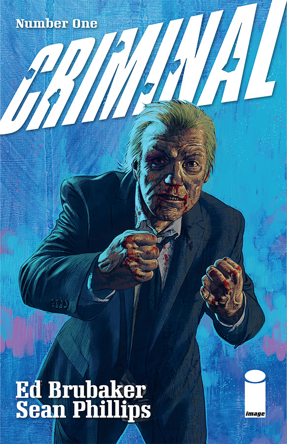
REVIEW: Criminal #1 is a gorgeous, modern classic crime comic

Criminal #1 is out 1/8/2019.

Criminal #1 is out 1/8/2019.

By Bo Stewart — Ed Brubaker and Sean Phillips tell the best crime stories in comics. Period, and it’s not even close. This creative team has forged a partnership over many years and dozens of volumes of comics (their recently concluded series Kill or be Killed made our top comics of 2018). They understand each other perfectly, and it’s a joy to see how this deep creative understanding ultimately deepens the words they create. It’s on full display here for their latest book, Criminal #1. Simply put, missing this comic would be criminal (please forgive me).

There’s something distinctly satisfying about Brubaker/Phillips comics, in that they somehow manage to provide the exact right amount of content. I never feel short changed, but the comic also never overstays its welcome or ends up feeling bloated. In the single-issue format, that kind of satisfying consistency is quite the accomplishment. These guys are so good that, in my opinion, comic readers take them for granted. This issue serves as a reminder that this creative duo tells the stories with the best pacing in comics.

Criminal is long-form storytelling at its finest. Instead of focusing on a single character or narrative, the creators lean into the world they have created for inspiration. Previous volumes of this book have each focused on a single character or event set within the Criminal sandbox, a sprawling epic that covers decades of crime and generations of criminals affected by it. The world of Criminal is well established, fully deserving of the old the world is a character axiom. It’s a sandbox that the creators clearly enjoy playing in, and, if this issue is any indication, the world of Criminal won’t run out of worthwhile stories any time soon.

Full disclosure, I have not read the entirety of the original Criminal run. The four (of seven) volumes I have read were all amazing, though. I was a little hesitant about starting this new run without having first finished the others, but, rest assured, newcomers to the series will have no trouble keeping up. Each volume has been its own standalone story and it appears as though the new run will follow suit. These stories inform one another, but they are in no way dependent on one another.

This latest Criminal #1 focuses on Teeg Lawless. Previous fans will immediately gravitate towards the protagonist because Teeg is a figure that has loomed large over the series (his sons Tracy and Ricky Lawless are main characters of previous volumes). This is a story interested in the cyclical nature of crime and how strong it’s grasp can be. Crime doesn’t just affect the individual criminal, it infects entire families. The gangster’s son becoming a gangster is a tale as old as time, but one that will always be ripe for exploration.

Phillips continues to improve (if such a thing is even possible), and his line work has never been more detailed. Teaming up with colorist Jacob Phillips (who is his son) brings a different dimension to the art. Heavy use of blacks and neons (you know, noir stuff) really lends itself to the storytelling. It reminds me of Mat Hollingsworth’s colors on Wytches but without the paint splotches. I have no reservations just coming out and saying it: this is Phillips’ prettiest book yet.

Overall: Ed Brubaker and Sean Phillips’ Criminal #1 is a perfect continuation of a crime series that ranks as a modern classic. If you enjoy crime fiction, in any format, this one is an absolute must read. 9.5/10

Criminal #1
Writer:
Ed Brubaker
Penciler: Sean Phillips
Colorist: Jacob Phillips
Publisher: Image Comics
Price: $3.99

For more comic book reviews, check out our review archives.

Bo grinds for the Man by day so he can create comics by night. He is the lesser half of the Stewart Brothers writing team and can be found on Twitter and Instagram @stewart_bros

REVIEW: Gunning for Hits #1 is a fascinating, if esoteric, look at the music BUSINESS

Gunning for Hits #1 is out 1/9.

By Zack Quaintance — The debut issue of Gunning for Hits has some heavy narrative lifting to do. This is, of course, by its own design. Gunning for Hits #1 is a normal-sized comic that essentially sets out to orient readers within two worlds: the always-tricky one of a new story (with its own setting, tone, characters, rules of reality, etc.), as well as the dense fiduciary side of the music business during the transitional (cassettes/vinyl to CDs) 1980s. Given the nature of this book—it’s a crime comic about the music business, after all—there is, of course, overlap. Still, the dual exposition makes for a relatively dense first issue.

Simply put, it’s a lot to read. It’s also fortunately a really interesting read, especially for anyone like myself who has dabbled in unhealthy or obsessive music fandom, to the point that just enjoying songs wasn’t enough and there grew a compulsion to learn about individual labels, promoters, etc. What Gunning for Hits seems bent on doing is pulling back that curtain in as entertaining a fashion as possible, and there are indications in this debut that the creative pair of new writer Jeff Rougvie and artist Mortit just might have the plan and artistic chemistry needed to pull it off.

Rougvie, for one, has the music business cred for this to be taken seriously by anyone with a passing interest in how their favorite hits were made for many years. You can find more on Jeff Rougvie’s website, as well as in the back matter of this first issue, but long story short: he’s been in the industry for decades, making things happen behind the scenes and most-famously working with David Bowie. To a certain type of person with an interest in both comics and music, it’s an incredibly lucky thing that someone with Rougvie’s resume is so motivated to tell a story with this medium that shares his vast insights and knowledge. Another fortunate thing is that he’s found an artist like Moritat who so clearly gets what Rougvie is trying to do here and is game to provide visuals. There’s a lot of text, and Moritat’s work deftly weaves around it, adding a grimy aesthetic to the proceedings and shining when it’s called upon to do so. It’s a great visual foundation for the esoteric knowledge Rougvie is dropping.

Readers shouldn’t, however, expect a light or overly-accessible read, especially not for those who have only a casual interest in music. This is specific stuff for people with some background related to at least part of its subject matter, be it music, or business, or both. I was fortunate to have an opportunity to interview Rougive about this book for ComicsBeat, and he cited Think Tank’s level of specificity as comparable to that found in Gunning for Hits, and there’s a lot of truth to that. Whereas Think Tank (a great and underrated comic, btw) relied heavily on military research and future-facing science, Gunning for Hits builds its own narrative atop bygone financial practices of a now-smaller business. It’s interesting stuff, to be sure, but it may have to work a little harder to win over any readers who aren’t initially intrigued by its premise.

Ultimately, whether or not Rougvie and Moritat are able to translate Rougvie’s music business insider status into a successful story that finds an audience will hinge on whether they can make a broader connection to the implications of capitalism on society at large, drawing a metaphor between the time and events in their story and our lives today. They’ve picked the right setting to do it—the greed is good 1980s—and the right aesthetic—crime. With my own propensity for getting lost in details and my love of music, I’m definitely compelled to keep reading.

Overall: Writer Jeff Rougvie and artist Moritat spend the majority of Gunning for Hits #1 orienting readers within the depths of the music business. They also lay some groundwork for the crime aspects of their story, which have the potential to be equally as engaging. It remains to be seen whether this act will harmonize in a way that results in chants for an encore, but there are some unique ingredients here that could make for a great comics story. 8.0/10

Gunning for Hits #1
Writer:
Jeff Rougvie
Artist: Moritat
Letterer: Casey Silver
Publisher: Image Comics
Price: $3.99

For more comic book reviews, check out our review archives.

Zack Quaintance is a tech reporter by day and freelance writer by night/weekend. He Tweets compulsively about storytelling and comics as BatmansBookcase.

REVIEW: Die #2 subverts D&D nostalgia trend by charging headlong into darkness

Die #2 is out 1/9.

By Zack Quaintance — In the first issue of Die, a group of six young friends disappears into a fantasy world, returning after time has lapsed, beaten up with one of them missing and another missing an arm. In a pop culture moment laced with relatively bright (Stranger Things may as well be Disney compared to Die) nostalgia-laden D&D remembrances, the first issue of Die set itself apart, staking its claim as a darker, more serious alternative.

And now Die #2 is somehow even darker.

I suppose it’s a little bit on me and my expectations. This additional darkness is not a bad thing, quite the contrary (we’ll get to that), but I certainly expected this book to set up maybe some darkness when the characters were middle-aged and dealing with trauma in the real world, before plunging them back into youthful, likely cathartic fantasy adventure. That may still come, but based on Die #2, things have to get worse before they can start to get better.

Fair warning...this next part may contain spoilers. There’s a scene in this comic wherein the character who’s been lost in the fantasy world all these years (and as a result is presumably a bit stunted) models a villian off a shared middle school or high school crush...and another character gleefully destroys here. It’s a very real scene, real and adult and sensical. But holy hell is it dark. The creators know this, though, and it’s certainly not played for sensationalism (often an issue in lesser comics). I think one of the other characters even remarks at how twisted the whole episode felt.

So yes, that’s the one we’re dealing with here. With that established, the larger question becomes does it function well in the service of the story. I was going to write entertaining story there but at this point that doesn’t quite feel apt, at least not yet. There will likely be a victorious counterbalance to the challenges at some point (that’s how stories work), but it’s early in the proceedings here and we’re not ready yet. I think it functions quite well. As I wrote in my Die #1 review this is a patient and assured book. Gillen believes in his story, and Hans...well, Hans is a towering talent of an artist and everything she does on the page here is nothing short of a joy. It’s a great combo for a story that I expect to keep ramping up like the most memorable role playing campaigns.

And really that is this comic’s aesthetic: it’s the most memorable role playing game you’ve ever played (complete with Gillen penning engaging back matter about dice and characters and classes...like the sterling GM he is) mashed up with what I think is a creator’s interest in examining the lives of his characters over time, the ways that they’ve aged and why, and, perhaps, whether they can recapture how it felt to be young, or, on a darker note, whether they can avoid habitual pitfalls that sowed some of their lives’ disappointments.

Overall: Die #2 continues to embrace realism and darkness within the context of a mystical and immersive life-altering role playing game. Just as the debut before it, this sophomore issue is a thrilling slowburn that sets itself aside from the current wave of D&D pop culture nostalgia by doubling as an uncut look at the disappointments of middle age. 8.5/10

Die #2
Writer:
Kieron Gillen
Artist: Stephanie Hans
Letterer: Clayton Cowles
Publisher: Image Comics
Price: $3.99

For more comic book reviews, check out our review archives.

Zack Quaintance is a tech reporter by day and freelance writer by night/weekend. He Tweets compulsively about storytelling and comics asBatmansBookcase.

REVIEW: Hardcore #1 is a crazy good idea with solid pacing

Hardcore #1 is out 12/19.

By Zack Quaintance — Robert Kirkman—creator of The Walking Dead, Invincible, etc.—is one of the best idea writers in comics, with any new series attached to his name pretty much guaranteeing a certain accessible sort of enthralling-yet-simple conceit. It’s a level of vision that has made him basically as successful as one can get within the industry. In fact, it’s been said that he first pitched The Walking Dead as having a twist part-way through that would see aliens arrive and have been responsible for the zombies, because no one but him could see a world in which just doing a simple zombie comic would work.

This is all a long way of noting that the idea behind Hardcore #1 was first created by Kirkman and seminal artist Marc Silvestri, back in 2010 for the Top Cow pilot season concept, which saw that publisher running a series of original concepts, essentially first issue pitches. Well now Kirkman’s own Image Comics imprint is reviving some of those (see Stellar early in the year), and Hardcore is among them.

Taken over here by the more-than-capable team of Andy Diggle (Thief of Thieves) and Alessandro Vitti (Iceman), Hardcore is the story of a government program involving a new technology that allows operatives to pilot the bodies of other humans, often using them as drone-like assassins to takeout threats to national security, or dictators, or whomever. The use of drone in that description is intentional, given that this comic goes to pretty blatant lengths to draw a connection between the tech central to its plot and drone piloting, essentially painting this as the next evolution of those military initiatives.   

It’s a solid enough idea, but one that could have played as simplistic if not executed properly. Diggle and Vitti, however, are a more than capable team to pass it off to, delivering a tightly-plotted and impeccably-paced story here that gleefully bounces from one suspenseful plot point to the next. This is a fantastic first issue, in that the creators here manage to fill us in on all the needed exposition in a way that feels like it has stakes, rather than being a transparent and slow info dump (a pet peeve of mine in debuts).

What also does wonders for this book is that rather than sticking to the straight governmental military angle, the story here introduces an element of proprietary conflict. Not to spoil too much, but the primary villain of this story is the man who invented the technology that allows users to occupy from a remote location the bodies of others. He resents that another pilot—our main character—has been tapped to use the innovation he developed, and...well, you’ll have to read the book, but what he does from there creates waves likely to power this story quite well moving forward. Vitti is a great choice to render this whole thing, deploying a style here that’s reminiscent of both the tech and military worlds at once, as well as intricately detailed in an almost photo-realistic way throughout much of the exciting proceedings.   

Overall: A fantastic execution of an unsurprisingly solid idea for a new comic, Hardcore is one of those first issues that expertly drops off all the needed exposition as it hops along its perfect pacing. The overall quality of this comic, however, will be determined by where it goes now that its foundation has been laid. 8.0/10

Hardcore #1
Story By:
Robert Kirkman and Andy Diggle
Writer: Andy Diggle
Artist: Alessandro Vitti
Colorist: Adriano Lucas
Letterer: Thomas Mauer
Publisher: Image Comics
Price: $3.99

For more comic book reviews, check out our review archives.

Zack Quaintance is a tech reporter by day and freelance writer by night/weekend. He Tweets compulsively about storytelling and comics as BatmansBookcase.

REVIEW: Freedom Fighters #1 prods us to appreciate history

Freedom Fighters #1 is out 12/19.

By Bo Stewart —  If you caught my review of Sara #1, you know how much I enjoy World War II stories. Something about that event—and the break in the human spirit it represents—lends itself to great stories. In many ways, I don’t think the world has recovered from WWII, and part of me believes we never will. Though many of us wish to move on, I find this lack of closure to be a good thing. Humanity needs constant reminders of the past or we will be doomed to let our mistakes repeat. Freedom Fighters is one such reminder. Like the TV show Man in the High Castle, Freedom Fighters reminds us of how pivotal World War II was to human history by reversing the script and creating a reality where the Nazis won, known in the DC Universe as Earth-X.

This debut issue does a lot of narrative heavy lifting. It gives us all the necessary background information on the original Freedom Fighters (established in the ‘60s), hints at an ongoing mystery surrounding the personified Uncle Sam, and sets the stakes for the central conflict with the modern-day version of the Freedom Fighters. Though this is a packed issue, it never feels overstuffed.

Our story opens on November 22, 1963 in Nazi occupied Dallas. Just as this is a significant day and place in real American history (the day and city of JFK’s assassination), it proves to be significant to the alternate history writer Robert Venditti is crafting. I’m not going to spoil what happens, but the event centers around Olympian and real-life American Hero, Jesse Owens, who also happens to be the leader of the original Freedom Fighters. Venditti is using these dates and historical figures deliberately. They are reminders of history that many have already forgotten. It’s a really nice and subtle way of layering (what I assume to be) the ongoing themes of the book into the narrative.

I suspect we will be following the modern-day team for the majority of the book, but I found myself more interested in the ‘60s sequence due to its bleaker tone. The art is impressive throughout, but I also can’t help but feel like it’s missing a ton of world-building opportunities. This is Nazi-occupied America – scenes where the sun is shining and kids are playing ball in a park just feel…off. The architecture, the vehicles, the fashion all feel too similar to our real world. Don’t get me wrong, the book is gorgeous, but it could have taken better advantage of its premise.

Alternate history is always a draw for me. Throw superheroes into the mix and you have the makings of a memorable book. Freedom Fighters has somewhat of a Watchmen feel in that a multigenerational superhero team is finding its place in a world where history took a drastically different turn. It doesn’t reach the thematic heights of that seminal graphic novel, but it also isn’t really trying to. I suspect the creators would be perfectly content if this book simply made us as readers reflect on our history and be grateful that we avoided the nightmare of this fictional world.

Overall: Freedom Fighters #1 is an ambitious book that cleverly uses alternate history as a prod to remember and learn from real history. 8.0/10

Freedom Fighters #1
Writer:
Robert Venditti
Penciler: Eddy Barrows
Inker: Eber Ferreira
Colorist: Adriano Lucas
Letterer: Deron Bennett
Publisher: DC Comics
Price: $3.99

Bo grinds for the Man by day so he can create comics by night. He is the lesser half of the Stewart Brothers writing team and can be found on Twitter and Instagram @stewart_bros

REVIEW: Long Lost Part 2 #5 is a colorful and explosive penultimate chapter

Long Lost Part 2 #5 is out 12/19.

By Zack Quaintance — Long Lost is a story about leaving your hometown—be it in rural America, the south, or the mountains—yet feeling a mysterious pull to return, that call to home that we all hear from our past. But when you get there, the place is nigh-recognizable. People have suffered. Relatives you thought you knew are so different as to be irreconcilable with who they once were in the past. They’re all acting out in strange ways, motivated by the hopes of enticing a magic cure for suffering, unemployment, sickness...even if their methods are making them all uglier.

This is a powerful metaphor (if I’m right about it) for our times, to be sure. And I think I’m at least partially onto something here. There’s a pretty telling bit of dialogue in this fifth issue of the story’s second half, with Piper—the more proactive and repressed of the two sisters at the story’s core—telling her sister how badly she just wants this town to be out of her life and gone. For many of our generation who’ve uprooted and found new homes in more urbane cities and enclaves, it’s a poignant and relatable feeling she’s expressing, one that in the past two years has maybe even come to have a damaging effect on our country. We’ve ignored difficult conversations and watched as family descend to a dark place where, ultimately, they vote against their own interests and become...ugly and unrecognizable...at least to us.  

I’m tempted to call this a good-looking and poetic metaphor for what it’s like to argue politics with friends, family and former classmates from a small hometown, but there’s another layer to Long Lost that I’m struggling to wrap my head around without yet having read the final issue. There are more intimate themes at work here related to the way our relationships as children shape us as adults. There’s also some moralizing, perhaps, about the value in forgiveness, in taking our family members for the good they provide while reconciling ourselves with their failings in order to move forward, especially if those failings are related to a mental illness (another presence that has loomed large throughout this story).

My own inability to completely process what’s happening in this comic aside, this is still one singular and gorgeous book that’s difficult to put down. In fact, it’s late on a Sunday evening as I write this and I’m going to push through and finish. I mean, there’s only one more chapter remaining. That’s a supremely high compliment for a penultimate issue if I’ve ever written one.

The only other thing I’d like to note before I move onto reading said issue is that Lisa Sterle’s artwork is fantastical and creepy all throughout this book. It’s a credit to her work that this deep into the story she’s still finding ways to make the tone all the more threatening and engaging without sacrificing even a little bit of clarity. Sterle’s work has been rather understated throughout the slow and mysterious burn of this comic, but—without tipping into spoiler territory—she is less restrained toward the end of this chapter. Her work becomes kinetic and rich with ominous tones, almost psychedelic as it reaches grand flourishes that really earn this story the thunderous climax on which this issue is ended.  

Overall: Long Lost Part 2 #5 perhaps marks the end of what has been one of the most poetic slow burn stories in all of comics, as this issue ends with a burst of colorful psychedelics. If you’ve been following this story, this is likely to be your favorite issue to date. 9.2/10

Long Lost Part 2 #4
Writer:
Matthew Erman
Artist: Lisa Sterle
Publisher: Scout Comics
Price: $3.99

For more comic book reviews, check out our review archives.

Zack Quaintance is a tech reporter by day and freelance writer by night/weekend. He Tweets compulsively about storytelling and comics as BatmansBookcase.