Thirsty Thursdays January 2019: A Thirsty New Year

By Allison Senecal — Superhero comic art has evolved at a really impressive rate in recent years...so much so that sometimes it can be a lot to handle. First there’s excitement, obviously, but then that excitement turns into something else...which is why each month we’re running our Thirsty Thursday rankings, a new and different way to look at our favorite comic art. Welcome to a sporadic examination of (as the kids say) the month’s thirstiest comics.

Enjoy!

Artist: Mahmud Asrar       
Colorist: Matt Wilson
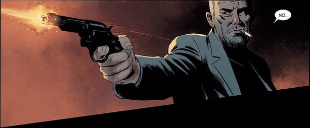
Conan the Barbarian #1 - I came into 2019 praying that the new Conan line from Marvel would deliver the goods every month, and so far it’s batting a thousand. It’s sexyyyyyyyyyyy. Here’s hoping Asrar and Wilson get to give us their take on Bêlit before they’re done. 💦💦💦💦💦 out of 5

Conan, what is best in life?

Conan, what is best in life?

Artist: German García
Colorist: Addison Duke
Barbarella/Dejah Thoris #1 - It’s been weeks and I still can’t shut up about how gorgeous and charming this damn opening issue was. García and Duke’s Dejah Thoris is the best iteration of the character I’ve ever seen, and they aced Barb’s whole vibe as well. The ideal blend of cute and sexy, with pitch perfect banter from Williams that I assume will only get better in future issues. 💦💦💦💦💦 out of 5

I hope someone brought water to this team-up because a thirst warning is in full effect!

Artists: Carlos Magno and Butch Guice
Colorist: Alex Guimarães
Invaders #1 - NAMOR! So much Namor! And Steve in a military jacket! NAMOR IN A SUIT! Bet y’all didn’t think Invaders could be a sleeper thirst series of 2019, but this art team is here to prove you wrong. 💦💦💦💦 out of 5

This guy on the left?…SAME.

Artist: Iban Coello
Colorist: Andres Mossa
Man Without Fear #3 - Tough to pick one issue of this series to highlight, and the whole thing was a Sad Matt™ thirst trap, but Coello and Mossa served up the saddest, sweatiest Matt so #3 it is. 💦💦💦💦💦 out of 5

Oh my dear dear Sad Matt™…so sad, so sweaty.

Artist: Juann Cabal
Colorist: Nathan Woodard
Friendly Neighborhood Spider-Man #2 - I know this series is about SPIDER-MAN, but Johnny Storm is babysitting in this issue! I don’t even like kids, but every time Johnny is adorable with them I feel that cynical void inside me whisper “oh %$#&”. 💦💦💦💦 out of 5

I think we all need a lot of things, Johnny.

Artist: Sana Takeda
Monstress #19 - A new crossbow wife???! I keep thinking Sana Takeda is done giving me MORE women with the best designs to swoon over but...Yafaela! 💦💦💦💦💦 out of 5

Is this a type? Can this be a type? I think this is my type…

Artist: Ramon Rosanas
Colorist: Tríona Farrell
Age of X-Man Alpha #1 - Rosanas and Farrell absolutely killed it on this. The character designs (largely courtesy of Mike Hawthorne) are all super swoony and it took me about 40 minutes to read because I kept lingering on every page. I’m sure you’ll be hearing more about Nightcrawler, the X-Tremists squad, and Prisoner X here at some point (okay, many points). 💦💦💦💦💦 out of 5

Clearly, this is the thirstiest timeline.

Artist: Adam Kubert
Colorist: Frank Martin
Captain America #7 - *drags hand down face* Steven Grant Rogers. I just want to thank everyone from the bottom of my heart for the cute sweater. That is all. 💦💦💦💦💦 out of 5

The right of people to choose…how hard they totally flip for freaking CAP IN A SWEATER.

The right of people to choose…how hard they totally flip for freaking CAP IN A SWEATER.

Artist: Caspar Wijngaard
Colorist: Mary Safro
Peter Cannon: Thunderbolt #1 - I admit — and maybe this hurts my journalistic integrity in regards to this column about thirsty comics art — this is the first comic in a long time I purchased purely as a thirst read. Gillen knows it!! He compared it to Dream Daddies in a solicit, for God’s sake. I don’t know #$%& about the Thunderbolt property but 1. this was a fantastic first issue, and 2. Peter and Tabu (and Nucleon???!!) are hot. 💦💦💦💦💦 out of 5

I’ll have a glass of that too because this book is seriously thirsty.

I’ll have a glass of that too because this book is seriously thirsty.

Sorry ahead of time for the panel by panel breakdowns of Daredevil #1-2 next month. You may think I’m kidding, but am I?

Check out The Thirstiest Comics of December.

Allison buys books professionally and comics unprofessionally. You can find her chaotic neutral Twitter feed at @maliciousglee.

REVIEW: In Amazing Spider-Man #14, Nick Spencer and Chris Bachalo payoff plots from the first issue

Amazing Spider-Man #14 is out 1/30/2019.

By Zack Quaintance — It is perhaps telling of exactly how old I am that to me Chris Bachalo is an artist that reminds me of how comics used to be, which is a phrase I think everyone uses to describe the time they first got into the hobbie. Simply put, Bachalo was huge when I was a new reader, helping to launch Generation X (the start of which was still a few years before my time), before moving over to help with some of the main X-titles, maybe even drawing Uncanny for a while as Grant Morrison and Frank Quitely did their thing on New X-Men.

Anyway, this is all a means to say that Bachalo is an absolutely perfect fit for a fill-in artist on Nick Spencer’s Amazing Spider-Man run, which is playing out holistically as a series as another example of how comics used to be, at least back in my day. This entire issue—from the art to the narrative construction to the use it makes of continuity—really feels like just a bit of a throwback to a different time, as has this run overall. The clearest example of this is that these Amazing Spider-Man comics are pretty clearly not written for trade compilations, not even a little bit.

You can really see it in this issue, which is 14 issues and six months into the run...and just now playing out pretty minor narrative threads that were dropped loosely into the background of Amazing Spider-Man #1, specifically thinking here of Peter’s offer from Conners. Now, not to sound like that old guy, but this is something that was once commonplace, back when stories weren’t conceived in six-issue bursts that should leave it all on the page lest the market dictate a sudden ending.

And the Connors thing isn’t the only bit in this issue drawn from #1. The conflict with Taskmaster and Black Ant was also seeded way back, possibly in the same scene with The Lizard (though I’d have to go back and verify to be certain). This is all well and good, and I like it because it scratches my long-form narrative itch as a reader. I think it’s an especially good thing for a book like Amazing Spider-Man, that publishes every other week. There really isn’t a need to so clearly define story arcs when the next chapter is generally 13 days away when you finish any given issue. The book should flow from plot to plot, carrying with it remnants as it moves into new territory. That’s certainly what Spencer and his artistic collaborators, whether it’s back in the day Chris Bachalo or regular series linework provider Ryan Ottley.

In terms of an individual read, this is a dense one, with multiple narrators, long conversations, and some pretty strong ideas jockeying for position, be it Aunt May’s disgust at her deceased husband’s sleazy accountant, or The Lizard’s son heartbreakingly wanting to just be a regular kid. There are so many emotional beats in this issue that it fades into a cacophony of feelings at times, making it hard for any one to move to the forefront and land with major resonance.

For me as a reader, that’s a great problem to have, especially for a comic I’m paying $8 a month to keep up with.

Overall: A dense issue of Amazing Spider-Man, packed with bits of continuity, big feelings, and payoffs to plot threads that have been dangling since the first issue. This series continues to have a narrative construction that calls back to times when stories weren’t written for trade, and it’s refreshing. 8.4/10

Amazing Spider-Man #14
Writer:
Nick Spencer
Artist: Chris Bachalo
Letterer: VC’s Joe Caramagna
Publisher: Marvel Comics
Price: $3.99

For more comic book reviews, check out our review archives.

Zack Quaintance is a tech reporter by day and freelance writer by night/weekend. He Tweets compulsively about storytelling and comics as BatmansBookcase.

REVIEW: Ice Cream Man #9 changes everything you knew about this book

Ice Cream Man #9 is out 1/30/2019.

By Zack Quaintance — Whoa. This issue was nuts, in the best way, and I’m going to do my best to not tip into spoiler territory here. However, I make no promises. So, if you really want to avoid any and all chance of spoilers, I encourage you to skip to the Overall section of this review down at the bottom for a spoiler-free word about whether you should buy this comic. If you have read Ice Cream Man #9, well friend, strap in, because this is about to get wild.

Ice Cream Man #9 up-ended my perception about the scope of this comic. It also sent me back through all eight of previous issues looking for clues. And you know what I found? Tons of them, along with a new sense of what this book is accomplishing. As I wrote in my review of Ice Cream Man #8, I thought this series was a commentary on instant gratification of the soul, on giving into easy feelings of fear and anxiety versus doing the difficult self work it takes to be optimistic, contented, happy. And it is that, to extent, but it’s also quite a bit more.

Ice Cream Man is a book telling an overarching story despite on its surface largely appearing to be an anthology series, albeit one with light connective tissue. The spider from the first issue here, a cop we vaguely know there, plus the titular Ice Cream Man and his weird enemy cowboy guy. A closer look, however, reveals that all along there has been a battle raging between two ancient polemic forces, one of malicious chaos and another that just wants folks to know we’re all friends, all connected, all just trying to live our peaceful lives.

To tell that story, writer W. Maxwell Prince, artist Martin Morazzo, colorist Chris O’Halloran, and letterer Good Old Neon have tapped almost every unique quality inherent to the monthly comics medium, ranging from the slow nature of the release schedule (used to draw the focus to the vignettes, rather than the forces in the background) to juke readers on the format of the narrative to the lettering, which is shaded white in boxes for the evil monologues and black fro the good. This comic has been a true work of patient serialized art, and now in Ice Cream Man #9, the creators are pulling what this book is really about from the background to center stage. And, to be crass, this sh** is f***ing epic.

I read this issue twice. The first time intrigued but bewildered. Then I went back and browsed previous issues for every appearance of the Ice Cream man, and I read it again. That time, I was absolutely blown away at what the creative team is doing. With that in mind, it is perhaps fitting and intentional that in Ice Cream Man #9 the old man character in this story tells the black-clad cowboy Caleb, End, beginning. It’s all the same, because Ice Cream Man is a comic built with no distinct start or end point. It’s a fluid story that demands repeat readings to really grasp its nature. At least the first eight issues play that way.

This issue pushed me to look back and also forward, seeding questions with every new reveal as if it were the work of David Lynch, who is a pretty clear influence on this whole deal, what with the idea that below the idyllic surface of life is bugs, as well as the counterpoint—we’re all the same and connected—which is rooted in Lynch’s beloved transcendental meditation and its universal field. But I digress and I’m getting long-winded here anyway, so let’s wrap things up...

Overall: The end of the beginning of the beginning of the end. An absolutely mind-wrecking read that suggests a more grandiose story than initially promised. Get past issues of Ice Cream Man nearby, because the creators have built something complex and subtle that will re-wire your perception of this series. 9.8/10

Ice Cream Man #9
Writer:
W. Maxwell Prince
Artist: Martin Morazzo
Colorist: Chris O’Halloran
Letterer: Good Old Neon
Publisher: Image Comics
Price: $3.99

For more comic book reviews, check out our review archives.

Zack Quaintance is a tech reporter by day and freelance writer by night/weekend. He Tweets compulsively about storytelling and comics as BatmansBookcase.

REVIEW: Wyrd #1 is a pastiche of classic comics atop some new truths

Wyrd #1 is out 1/30/2019.

By Zack Quaintance — Dark Horse Comics’ new original series Wyrd is a pastiche of classic comics ideas used to uncover deep truths about country, contentment, and feeling out of place in a harsh world. Wyrd is a dash of Mignola, a healthy serving of the most twisted Captain America you’ve ever seen, and a foundation of a main character whose attitude has more than a little in common with John Constantine from Hellblazer. But in between all the homage, a unique writer’s perspective shows through.

That writer is Curt Pires, and in this comic he spins some of the best writerly dialogue in recent memory. There are nice turns of phrases throughout, usage of prose that would hold its own in grad school level creative writing workshops (as much as any prose ever does in those cruel things). Two examples stuck in my mind most clearly after reading. And I’ll get to them both, but first a brief summation of our plot.

Our main character is Wyrd, a freelance monster hunter/weird shit handler for the U.S. government. In this first installment, we learn that he’s troubled, maybe even suicidal, before seeing him shipped off overseas to hunt a super soldier out of control. It’s a relatively simple story in setup but not in execution. Within this solid framework, Pires and his artistic collaborators Antonio Fuso and Stefano Simeone do some seriously heavy lifting with mood, aesthetic, and tone.

Fuso and Simeone’s artwork gets pretty gruesome at times. I’m not always one to appreciate a violent comic, but I had no issue with the way harsher visual storytelling was deployed here. In other words, the proceedings never tipped into gratuitous or repulsive. There are in-set panels a plenty showing the damage Wyrd incurs as he fights, but all of them are necessary to establish his regenerative abilities (add Wolverine to our pastiche, btw). Simeone’s colors push the visuals a step further, especially in the flashback scenes that use a duller set of shades without deploying the sepia cliches. Wyrd #1 is by design a grizzly and rough-looking comic, and that’s good, it should be.

The forlorn beauty of this book is in its language. Let’s get to those promised bits of writing that really stand out. The first is the monster at one point telling Wyrd, I can see through you. Transparent. You’re a ghost in a man suit. A black hole covering memory. It makes sense in the plot but one also gets the impression that Pires might just feel that way period and is using this as a chance to express it. It’s these little gold coins that lead readers throughout the comic.

The second is the gorgeous soliloquy at the end about the joy and hope a child represents in the world. It’s a subtle moment. I might even call it understated if it didn’t serve as a coda for everything that came before, and I absolutely loved it. Wyrd’s self-destructive drinking and sarcasm would run the risk of feeling too familiar if it wasn’t bookended with the poignant reason for his discontent. A great decision by the storytellers that sets up a fascinating series moving forward.

Overall: Wyrd #1 is one part deep comics pastiche and one part introspective look at a troubled man, likely at a point in his (too long) life where he’s lost any belief in the systems. This is a solidly-constructed comic that might just grow into something really special. 8.2/10

Wyrd #1
Writer:
Curt Pires
Artist: Antonio Fuso
Colorist: Stefano Simeone
Letterer: Micah Meyers
Publisher: Dark Horse Comics
Price: $3.99

For more comic book reviews, check out our review archives.

Zack Quaintance is a tech reporter by day and freelance writer by night/weekend. He Tweets compulsively about storytelling and comics as BatmansBookcase.

REVIEW: Peter Cannon Thunderbolt #1 is a superhero romp with a provocative end

Peter Cannon: Thunderbolt #1 is out 1/30/2019.

By Zack Quaintance — If you do not follow my instructions precisely, this planet will be dead before the day is out...but the task is not impossible. This is a mission statement for the comic and also a telling look into the personality and capabilities of the the protagonist—Peter Cannon: Thunderbolt. Which is all well and good for a reader like me, who is only vaguely aware that the character has a long history (dating back to 1966, turns out), created by legendary comic book writer/artist Pete Morisi for oddball Charlton Comics. Incidentally, as interested as I am in the history of DC Comics, I did not know the character had ever cropped up there, but he has. I did know he was the inspiration for Watchmen’s Ozymandias, which will come into conversation later, but I digress...

So, what’s up with this new Peter Cannon: Thunderbolt comic book then? Well, it certainly has the right creative team, or at least one that I’d deemed A List. Kieron Gillen is one of the bigger names in monthly comic book writing, having worked on a number of beloved runs at Marvel Comics as well as notable creator-owned books liked The Wicked + The Divine and, most recently, Die (which rules, btw). Providing the art is Casper Wijngaard of the severely under-appreciated creator-owned comic, Limbo, and his work is brought to such vivid life here by colorist Mary Safro.

This is, indeed, a very visual comic book, which sounds odd to say about a medium that’s always very visual, but it’s true: this book brims with gorgeous splash panels, drawn by Wijngaard and Safro. In fact, more than any of Gillen’s other recent new books—his work on Star Wars, Die—it feels like he spends much of this comic trying to get out of the way here, letting the visuals carry readers through the rudimentary stuff, the introductions to the world, the people, the threat it faces, and the way Cannon is almost immediately able to concoct a solution.

Gillen really makes his presence felt at the end, however, when he shows his hand and unveils the conceit of this comic: this book borrows pretty directly from the plot of Watchmen in some really crucial ways. Not to go too far into spoiler territory, but both the reason the threat has come to Earth and the person who sent are essentially right out of the pages of Alan Moore and Dave Gibbons’ seminal comic. This has been a controversial artistic move in the past when done by the property’s actual corporate owners, DC Comics, but I imagine (relatively) small fry dynamite and indie comics good will hoarders like Gillen and Wijngaard will be given the leeway to tell an intriguing story with this concept. Besides, Ozymandias himself was essentially borrowed IP from the original Peter Cannon: Thunderbolt, which sends my mind down an infinite rabbit hole just thinking about it.

Overall: A pithy and entertaining read with some nice throwaway commentary for much of its duration, the real promise and potential of this comic becomes clear in its final pages. For long-time students of comics as well as recent die hards who’ve looked back even a bit, I highly recommend giving this debut issue a shot. 9.2/10

Peter Cannon: Thunderbolt #1
Writer:
Kieron Gillen
Artist: Casper Wijngaard
Colorist: Mary Safro
Letterer: Hassan Otsmane-Elhaou

For more comic book reviews, check out our review archives.

Zack Quaintance is a tech reporter by day and freelance writer by night/weekend. He Tweets compulsively about storytelling and comics as BatmansBookcase.


Top Comics to Buy for January 30, 2019

By Zack Quaintance — Ah! Here we are on the first fifth Wednesday of the year. Jeez, 2019 really wasted no time in giving us one of those to deal with. Luckily though, this fifth Wednesday is a bit atypical. DC Comics didn’t ship any new books for the fourth Wednesday in December, effectively bumping a ton of titles to this one and making it seem a bit less unusual. So, there’s that little nicety.

And, as usual, the other publishers put out plenty of nice titles too! In our Top Comics to Buy for January 30, 2019, we have another diverse group of titles, coming from publishers ranging from the Big 2 to Dynamite to Image. We’re a bit heavier on the superhero stuff than usual, but, also, Ice Cream Man #9 is so totally bonkers that it makes up for any feeling of staid cliche that might arise from the other choices. Seriously.

Enough banter, though! Let’s move onward to this week’s top comics!

Top Comics to Buy for January 30, 2019

*Pick of the Week*
Peter Cannon: Thunderbolt #1
Writer:
Kieron Gillen
Artist: Casper Wijngaard
Colorist: Mary Safro
Letterer: Hassan Otsmane-Elhaou
His level of genius is matched only by his heroics, and in humanity's darkest hour, he's the hero they need the most-alas, poor humanity.  Peter Cannon-the man known as Thunderbolt-is only too happy to leave civilization to face its end. Kieron Gillen (The Wicked + the Divine) teams up with powerhouse artist Caspar Wijngaard (Doctor Aphra) as he returns to the superhero genre with a dark, humorous and relentless love song to the genre. Well, "Love Song" in a Leonard Cohen Love Song kind of way. Peter Cannon, Thunderbolt: saving a world he hates.
Why It’s Cool: We have a review coming tomorrow that will explain the coolest of this book in much greater depth, but, simply put, this is just a great comic. It reads really well, created as it is by major talents like Kieron Gillen, Casper Wijngaard, and Mary Safro. Moreover, the last page reveal sets up an absolutely intriguing premise that I for one cannot wait to see play out. I didn’t really know what to expect from this title going in, even though I like the creative team. Now? Totally hooked.

Action Comics #1007
Writer:
Brian Michael Bendis
Artist: Steve Epting
Colorist: Brad Walker
Letterer: Josh Reed
Publisher: DC Comics
Price: $3.99
The Kobra Cult conspiracy ensnares Daily Planet photographer Jimmy Olsen, drawing the attention of the Man of Steel. But be careful, Superman-there's more lurking in the shadows of Metropolis than just a snake cult.  
Why It’s Cool: In my humble opinion, Brian Michael Bendis’ ongoing Superman saga just keeps getting better. This issue is a whole lot of setup, illustrated brilliantly here by Steve Epting with Brad Walker colors. Bendis continues to use more and more of the Superman mythos to tell this ever-expanding story, which is apparently gearing up for a big-time summer event centered around Leviathan. Ah well, check it out for yourself!

Amazing Spider-Man #14
Writer:
Nick Spencer
Artist: Chris Bachalo
Publisher: Marvel Comics
Price: $3.99
You know what's annoying? Having to save J. Jonah Jameson's life. Sure, he's been on Spidey's side for a little while, but that's after YEARS of him making Spider-Man's life a living heck. I feel like this amount of responsibility should come with even more power. Anyway, who, other than most of New York, would want to punish J. Jonah Jameson?
Why It’s Cool: One of my other major Big 2 superhero pleasures of the moment is the ongoing Amazing Spider-Man run by Nick Spencer, who is joined this time by veteran artist Chris Bachalo. This book just wrapped up a poignant arc in which J. Jonah Jameson seemed to maybe learn something...and now apparently all of New York City is coming for J. Jonah Jameson. I am 100 percent there for this, since I’m yet to dislike an issue in this run.

Ice Cream Man #9
Writer:
W. Maxwell Prince
Artist: Martin Morazzo
Colorist: Chris O’Halloran
Letterer: Good Old Neon
Publisher: Image Comics
Price: $3.99
NEW STORY ARC
"HOPSCOTCH MÉLANGE," Part One
A wild western one-shot which witnesses the way the world once was.
Why It’s Cool: Ice Cream Man has been one killer comic since its start, seemingly dealing in a series of disparate vignettes that share one commonality: the titular Ice Cream Man makes a sinister and brief appearance in each story. Well, now we’re about to learn just a bit more about that (maybe). This marks the start of this book’s first multi-part story arc, and, perhaps unsurprisingly, it’s bonkers as all get out, going full Stephen King’s Dark Tower in the process.

Terrifics #12
Writer:
Jeff Lemire
Artist: Viktor Bogdanovic
Inker: Jonathan Glapion
Colorist: Michael Spicer
Letterer: Tom Napolitano
Publisher: DC Comics
Price: $3.99
The Terrifics disband, but they're going to need to get back together if they're going to save Mr. Terrific from Doc Dread's new team, the Dreadfuls! Plus, Rex Mason takes a huge plunge, Phantom Girl bolts Bgztl and Plastic Man stretches out the family drama with his son Luke, who's struggling with his own super-elastic powers. Will our heroes reunite in time to save Mr. Terrific-from an evil version of themselves?!
Why It’s Cool: Jeff Lemire and his collaborators have somewhat quietly been doing absolutely wonderful work on this little book since its start. That work continues here with The Terrifics #12. Lemire is approaching his end game with just two issues left to go, and here he gives us what for my money is the story currently making the best use of the DC Multiverse. Also, there are some all-time great moments in this comic between Plastic Man and his estranged son. All-time great.

Top New #1 Comics

  • Age of X-Man: Alpha #1

  • Fight Club 3 #1

  • Journey Into Unknown Worlds One-Shot

  • Mysteries of Love in Space #1

  • Wyrd #1

Others Receiving Votes

  • Bone Parish #6

  • Captain America #7

  • Catalyst Prime: Kino #13

  • Crimson Lotus #3

  • Detective Comics #997

  • Exiles #12

  • Flash Annual #2

  • Justice League Annual #1

  • Lone Ranger #4

  • Marvel Knights 20th #6

  • Punisher #7

  • Quantum Age from the World of Black Hammer #6

  • Skyward #10

  • Teen Titans Annual #1

  • Vagrant Queen #6

See our past top comics to buy here, and check our our reviews archive here.

Zack Quaintance is a tech reporter by day and freelance writer by night/weekend. He Tweets compulsively about storytelling and comics as BatmansBookcase.

Comic of the Week: Buffy the Vampire Slayer #1 is a new start with much love for the original

Buffy the Vampire Slayer #1 is out 1/23/2019.

By d. emerson eddy — Into each generation a slayer is born...or reborn as it were. To many my age Joss Whedon's television series, Buffy the Vampire Slayer, Angel, Firefly, even Dollhouse, served as a backbone to our cultural development. Particularly Buffy and Angel since they came first. They informed a lot of our attitudes towards the world, reflected many of our musical tastes and speech patterns, and all around showed a world where it was all right to be the outcast, the fringe, the geeky nerd, because you'd be accepted into a family of like-minded weirdos. And, of course, you'd look fabulous while dusting vamps.

It's been 15 years since Buffy and Angel have been on the air, in that time culture has changed, in some ways evolved, in some ways regressed. In those intervening years, Dark Horse and IDW continued on the legacy of the Whedonverse, sometimes taking it to welcome places, sometimes strange. At times for me it was like checking in with a friend that you've lost touch with and grown apart, but when you see one another you're picking up old conversations like you've not lost a beat. Because the memory remains.

BOOM! Studios' new launch of the series does not continue on from any of the previous comics or television series. Instead, it takes us back to a new interpretation of the beginning, and I'm perfectly okay with this. It feels right to start again, especially when it's being done with as much skill, reverence, respect, and outright love of the source material as it is by Jordie Bellaire, Dan Mora, Raúl Angulo, and Ed Dukeshire. The old, familiar faces of Buffy, Willow, Xander, and Giles are here representing that core configuration. Slightly different than before, but still capturing that same spirit.

With Redlands, Jordie Bellaire has proven that she can write horror and the supernatural very well. With this first issue of Buffy the Vampire Slayer, she transports some of that with the usual vampires and ancient relics and such, but she also shows an ear for the catchy dialogue and banter that was a hallmark of any Whedonverse joint. It's not a copy of Whedon and co.'s dialogue patterns, but like the overall story, it captures the spirit.

Likewise with Dan Mora's gorgeous artwork. His approach to likenesses is interesting, because the characters are recognizably Sarah Michelle Gellar, Allyson Hannigan, et al. yet simplified. He makes the characters his own, such that we don't have any of the common bizarrely over-rendered stars in a comic compared to the supporting and background characters. And equally excels with the action as with the quieter interpersonal moments.

Raúl Angulo's colors perfectly complement Mora's line art, giving the series a somewhat ethereal glow. It reminds me somewhat of the color approach that the “New Riverdale” line from Archie Comics had of mixing some of those classic vibrant comics colours with a bit of a modern haze. It works really well for adding atmosphere to the story.

Ed Dukeshire rounds out the creative team here, performing his usual exemplary job of providing some tight lettering, showing some interesting variation for vampires and the narration.

Overall, this relaunch is very well done. As a longtime follower of Buffy and the Scooby Gang, I think that Bellaire, Mora, Angulo, and Dukeshire have done a very good job at capturing the spirit of the property while also weaving it into a new and compelling story. Even if you've somehow never experienced Buffy the Vampire Slayer before, it introduces well to the cast and the overall premise and tone of this new series. There are also some surprise appearances and a twist in the tale that should have everyone champing at the bit to see the next issue.

Buffy the Vampire Slayer #1
Writer:
Jordie Bellaire
Artist: Dan Mora
Colorist: Raúl Angulo
Letterer: Ed Dukeshire
Publisher: BOOM! Studios
Price: $3.99

Check out past Comic of the Week selections by d. emerson eddy on the list page.

d. emerson eddy is a student and writer of things. He fell in love with comics during Moore, Bissette, & Totleben's run on Swamp Thing and it has been a torrid affair ever since. His madness typically manifests itself on Twitter
@93418.

TRADE RATING: Sara by Garth Ennis and Steve Epting is great start for TKO Studios

Garth Ennis Sara, with art by Steve Epting, is available now via TKO Studios.

By Jarred Luján — TKO Studios recently rolled out their debut line-up, which was essentially headlined by Sara, a story about an all-female Soviet sniper unit fighting against the Nazi invasion of their country. I snatched Sara up pretty quickly because of my familiarity with both the writer and artist. Garth Ennis wrote one of my favorite books of all time, Punisher: Born, Steve Epting drew one of my favorite Captain America stories back in the day, collaborating on it with Ed Brubaker.

Before I dive deeper into the story here, I want to make something clear: the art in Sara is absolutely brilliant. While this book, of course, has its fair share of shootouts and battles and explosions, some of my favorite moments involve Epting’s artwork showing the small expression changes on characters’ faces. Ennis’ script did a fantastic job building up these characters, but it’s Epting’s art that really emphasizes character moments in a way that creates a more engaging reading experience. For those of us who have read comic illustrated by Epting in the past, this comes as little surprise.

Snowy Soviet plains probably do not sound like the best backdrop for a colorist to flex their talents, but Elizabeth Breitweiser does so here. Again, I’m talking mostly about small things, like the rosy cheeks in the midst of the brutal cold. Each moment a sniper bullet tears through a Nazi, the colors create a beautiful contrast of red mist and snow. So many of these pages are littered with black and white tones, yet they still convey much depth in various areas.

So, going into the story itself, it’s probably relevant to note that I have personally lived my entire life surrounded by soldiers. On my mother’s side, I am literally the only male that didn’t enlist (I doubt I’ll ever hear the end of that one, btw.) My family being the way it is meant I grew up with a mixture of war being mythologized and lessons on the darkest aspects of armed conflict from people who had firsthand experience. Growing up, I’d often sit around and watch war movies with my grandfather, or exchange war books with my step-grandfather, who both regularly shared personal anecdote from their times in Korea or Vietnam…sometimes these were funny stories or tales of heroes, and sometimes they were downright terrifying.

This is all a means of noting that war stories tend to draw me in more than they might the average person. Generally, there are two common ways that war stories are told. The first is your basic Good Versus Evil. It’ll usually feature the sacrifice of Good Heroes, who are certain their side is right and just, with a tinge of patriotism painted underneath. The second is about What War Takes Away. These stories feature good people doing evil deeds, corrupted by the nature of warfare. This often means a loss of decency, hope, morality, life, and—almost always—innocence.

That first type of story is typically the most common way that we see depictions of World War II. There are few human conflicts where it’s so clear where each side stands, what each side represents. Sometimes these stories gloss over the wrongdoings of the side they represent, in an effort to represent them well.

With Sara, Ennis has no interest in doing that. Sara, for whom the story is named, is an extremely conflicted character. She kills Nazis, sure, even efficiently, but Sara time and time again reflects on the cruelty of her own nation, the one she’s defending. This theme lends to some of the best character moments in the book, people clinging to the ideal outcomes of this war, and a jaded Sara trying to figure out where she stands in the first place.

This second type of grey morality story is how the greatest war stories are told. Ennis, though, has a reputation for flipping war stories, for creating a third option all his own. That ability is what made his work on Punisher: Born so brilliant: Ennis concocted a story of Frank Castle seemingly losing something, but it isn’t until the final pages that readers learn he has instead brought something back with him. It isn’t loss, it’s converting.

Ennis does more subversion of expectations in Sara. Sara’s comrades are the vehicle for this, rather than the dark captioning system that he used to accomplish it within the narrative of Punisher: Born. The parts of the story set in the past here also help us understand what’s happened to Sara to make her feel so ambivalent about the nation she finds herself serving. We discover that it wasn’t the loss of any one thing for Sara, but rather a gaining of truth. A truth that Sara’s devoted friends are not prepared for.

Sara is a slow burn of a book. The first couple chapters really focus on building the situation around Sara and her team, but ultimately that slow burn becomes an explosive flourish. The ending of this story fires on all cylinders, with Ennis teaching a master class on pacing. Sara, in the end, is a comic that incorporates many aspects of the real war stories my family has shared with me throughout my lifetime. Stories about that include patriotism, heroes, and glory, as well as terror, uncertainty, and doubt. Sara is a rarity in that it blends all of those things organically into a single powerful tale.

Overall, TKO has picked a worthy story from a seasoned creative team to represent the publisher well at its launch.

Sara #1
Writer:
Garth Ennis
Artist: Steve Epting
Colorist: Elizabeth Breitweiser
Letterer: Rob Steen
Publisher: TKO Studios
Price: Digital $13.99, Paperback $17.99, Individual Issues in Collector’s Box $24.99
Get It: Via TKO Studios

Check out more of our thoughts about trade paperback and original graphic novel on our reviews page.

Jarred A. Luján makes comics, studies existential philosophy, and listens to hip-hop too loudly. For bad jokes and dog pictures, you can follow him on Twitter.


The Saga Re-Read: Saga #25 is the most grandiose chapter yet

Saga #25 was first released 2/4/2015.

By Zack Quaintance — Saga #25 is the first issue back from the break, and, apparently, the creators used the time away to conceptualize and execute one of the series’ most grandiose chapters yet. I most certainly did not pick up on this my first time reading through, so consumed was I with what exactly was about to happen next, but it’s pretty evident here.

I’ll go into more detail about this below, but the most notable thing about this issue is that in it, the creators finally crack and give us the broadest view yet at the war that has riven the galaxy and essentially given rise to the events of this story. We get a macro view of it all, one that ranges from showing how the conflict has become unnoticed for most on the homefront to the history of enlistment techniques. It all leads up to a last page that shows us an inevitable reaction to a forever war—political opposition.

Let’s check Saga #25 out!

Saga #25

Here it is, the official preview text for Saga #25, which was first released all the way back on Feb. 4, 2015, with 10 whole days left to buy a copy for your significant other for Valentine’s Day (aw!)...

Saga is back, as is almost the entire cast! And as thanks to retailers and readers for helping our audience continue to grow every new arc, Fiona Staples created an amazing wraparound cover for this action-packed issue, which is still only $2.99, the best deal in comics!

This is the longest Saga preview so far, but in keeping with the established pattern, it tells us absolutely nothing about the plot. It does, however, speak to the idea that the book had become a certified mega-hit at this point, so much so that it staying at $2.99 (which has now ended) was actually a really good deal. Anyway, onto the individual elements...

The Cover: This cover is one of the more epic in scale, a wrap-around featuring action and more characters than any other Saga cover to date. It’s busy by design, which actually sets it aside from most of the other covers in this series while making it more at home among the other sci-fi comics on the rack. It’s not among my favorites, I’ll say that much, but I don’t hate it either. Coming back from one of the book’s breaks, it does a great job reminding us of what’s happening and who are our principal actors.

The First Page: Like the cover, the first page of this issue also stands apart a bit from the rest of the series. It’s black and white, subdued, and split into multiple panels, a stark contrast to the full-page splash of a shocking or fantastical, full-color image that we usually get (a couple of which actually come later in the comic). Conceptually, I like this quite a bit. The visuals are ho-hum, but it works well for the narrative, giving us some historical context for the forever war that has both created and shaped the little family at the center of our story. It’s specific to this space opera, and the next few pages go on to convey universal ideas we’ve seen play out in our own society as it relates to war. We don’t often get broad looks at the conflict here, but when we do, the creators tend to make them count. This is a great example.

This uncharacteristic Saga first page starts our first super broad view of the war at the heart of this series.

The Surface: The first five pages of this issue are the most direct look at the war the series has given us yet, with Hazel the narrator taking the 20,000-foot (or would it bee 20,000-light years?) view of what’s happening, how it’s progressed through time, and how it affects many of the residents of the two central planets. It’s interesting that it took 25 issues to get here, to some extent, but really, the story was so engaging with its hyper focus right from the start, that it had the freedom of leaving the war around the edges. The creators probably could have withheld that five-page explainer further, but they knew they had their audience on the hook. Also, I’d imagine it simply felt like time. Following the expository opener, Saga #25 goes on to bounce between our many sets of characters. Three months have passed, and the surface of this comic has a bit of work to do catching us up to the various status quos.

The Subtext: The subtext in Saga #25 is largely about hierarchy. It’s so prevalent in the opening five-page explainer that it’s basically surface level, but it pops up a couple times later, first when Marko’s mother tells Alana to get it together because they aren’t helpless damsels in distress, and later when Prince Robot IV tells Marko he is forbidden to address him directly, despite their shared plight and mutual objectives. These are all subtle-yet-effective ways to remind us this universe, much like our own, is one built on rigid social pecking orders. It all leads up to the introduction of the Rebellion Revolution...a group of characters I had 100 percent forgotten about.

The Art: Fiona Staples is given a chance early in the book to go full Star Wars, depicting scenes of intergalactic war and outsized alien monsters. And she knocks it out of the park. Fiona Staples is also given a chance to show what it looks like for many denizens of this universe on the homefront. And she also knocks that out of the park. These returns from a hiatus, with their presumably lengthier lead times, are always an absolute visual treat, and this issue is no exception.

The Foreshadowing: A little heartbreak with the foreshadowing here as Hazel lets us know that it would be years before she and Marko are re-united. But hey, at least we know they’re eventually re-united!

Saga #25
Writer:
Brian K. Vaughan
Artist: Fiona Staples
Letterer: Fonografiks
Publisher: Image Comics

Check out past installments of our Saga Re-Read.

Zack Quaintance is a tech reporter by day and freelance writer by night/weekend. He Tweets compulsively about storytelling and comics as
BatmansBookcase.

“Keep Looking Up”: An Interview with Peter Krause

The Millionaires’ Magician is available now via the book’s website.

By Andrew Scott — Not every graphic novel begins with a foreword by a legendary illusionist.

But then, The Millionaires’ Magician bucks many of the norms associated with American comics today. The narrative is autobiographical, except when it’s not (which is nearly every page). The concept belongs to magician Steve Cohen—and readers can buy the book directly from his website—but the story credit goes to another writer. Some readers might find it odd that the credit for Copperfield’s foreword precedes the names of the creators who actually produced the book.

That said, Copperfield does capture the essence of this graphic novel succinctly: “The behind-the-scenes story is as engaging as the magic [Steve Cohen] performs. Like any good fable, it weaves fact with fiction, truth with tall tale, into a memorable read.”

What he means is (spoiler alert) the character of Steve Cohen spends years hiding in Japan and training in the martial arts before returning to New York to save the innocent and exact his revenge. If you don’t know about Steve Cohen, this Q&A is a good primer for understanding the basics of his act and philosophy. In short, his is an old-school magic performance. Sleight of hand. Quick fingers. No explosions or loud music. If you’ve seen him perform—and some of you might remember his appearance on David Letterman’s Late Show—the idea of Cohen-as-superhero has to bring a smile to your face.

But despite this magician’s obvious skill, no amount of trickery can produce a completed graphic novel to pull from a hat. For that kind of magic, he had to turn to the professionals. Keith Champagne gets the story credit, while Bill Tortolini is the letterer and Tara Phillips is the cover artist. But my primary interest in the project is the art by Peter Krause and colorist Jordie Bellaire.

From Daredevil: Road Warrior.

Cohen says he admired Krause’s work in the Daredevil: Road Warrior comic. “I instantly knew that he was the artist for my book,” he says. “I had rejected other artists’ portfolios because their style was too modern. The specific vision I had in mind pointed at the moody styles of Alex Toth and David Mazzucchelli. Peter’s work on Shazam also convinced me that he was the right artist for this project.” Cohen admired colorist Jordie Bellaire’s “textured color work,” as well. Bellaire currently lives in Ireland, so Cohen invited her American parents to attend his show at the Waldorf Astoria New York. “Their endorsement of the show clinched the deal,” Cohen says, “since Jordie ultimately agreed to participate. That was a happy day in the development of this project.”

Peter Krause is a productive artist with a long career who is still under-appreciated, in my opinion, despite that steady work. Irredeemable and Insufferable, both with writer Mark Waid, are certainly worth your attention, and I wouldn’t be surprised if his recently completed Archie 1941 series—for which he again partnered with Waid, as well as co-writer Brian Augustyn—garnered some attention from industry award committees this year.

The Millionaires’ Magician is a great-looking, fun book. I wanted to interview Peter Krause to learn a little more about how he became involved with the project, as well as his approach to making comics in general.

From The Millionaires’ Magician.

How did you end up working on The Millionaires’ Magician? What compelled you about the concept?

PK: Keith Champagne contacted me in the spring of 2015. He had a preliminary outline of the script. I was immediately taken with the visual possibilities of the story—magic, foreign intrigue, and crime. My work has evolved to a more noir-like approach and The Millionaires’ Magician seemed like a perfect fit.

I’d also be able to work on this with no monthly deadlines. That allowed me to do various storyboard projects, as well, and to really perfect the drawing on The Millionaires’ Magician.

After a bit of email communication, everyone agreed to terms and we were off!

Were you familiar with Steve Cohen and his act before this?

PK: I was not. But Steve provided plenty of back story, photo reference, and video of his appearance on Letterman. Steve is an energetic guy, and a huge comics fan. He enjoyed my artwork on Daredevil: Road Warrior. It’s what prompted him to contact me via Keith for TMM.

How long did it take you to complete the story? What’s a typical work day look like for you?

PK: The book is a 100-page graphic novel with a handful of added illustrations. It basically took a year for all the line work. There were a few revisions per Steve’s request and the line drawings were completed by the end of September 2016.

I like to be in the studio in the morning to begin the day. I’ll start around 8:00 a.m. and work until 5:00 p.m.—that’s the ideal. I will get some storyboard work now and then that entails some evening hours. But I don’t do night shifts for comics. I think it’s counterproductive and you pay for it with reduced efficiency the next day.

I’m all digital now, as well. I draw on a first-generation Cintiq. One of these days I’ll update it.

From The Millionaires’ Magician.

Was it your request to have Jordie Bellaire color your work, or was that something the rest of the team already had in place? If she’s not the best colorist in the business, there’s certainly no one who is clearly better.

PK: When we were thinking about colors for TMM, Jordie was at the top of the list. Steve was very familiar with her work and really wanted her for the book. I can’t say I really know Jordie, but we had communicated a few times on Twitter. I was the one who reached out with a great page rate that Steve offered. We were all overjoyed when she agreed to terms.

Before she started enhancing the line drawings with her hues, she sent me an email asking for my coloring preferences. I’d never had that happen before—understandable because comics is generally such a deadline driven monster. I had a couple of suggestions, but at the end I told her I trusted her judgment. Really, who wouldn’t? Her work is so wonderful. It was a career highlight to be colored by Jordie.

You stopped drawing comics for a number of years. What prompted that move? It seems to have coincided with some pretty lean years in the industry after the 90s bubble burst.

PK: Great question. If you get into comics, I think you have to be aware of the history. I saw what had happened to the previous generation of artists that had “aged out” of the industry. I vowed I wouldn’t be completely beholden to comics work. When I left Power of Shazam!—I think that would have been around 1997 or 1998—I began to ask around for other stuff and didn’t get any response. But I had been doing some ad work and storyboard jobs on the side, so that became the focus of my work. Also, my darling wife Lisa was doing fine in the tech world, so things weren’t dire.

Other than a handful of fill-ins for DC, it wasn’t until I started working on Irredeemable for Boom! Studios that I was drawing comics full-time again.

From The Millionaires’ Magician.

The Millionaires’ Magician, Archie 1941, and even Insufferable before that—your work has moved to the next level in recent years. What do you think is the reason for that? Is it because you’re working digitally, inking yourself, or something else?

PK: Thanks for the kind words. If true, I think it has to do with all of what you’ve mentioned.

Working digitally gives you a tremendous amount of flexibility to resize and revise. As long as you don’t go down the rabbit-hole of trying to reach perfection it is also a big timesaver. It eliminates the bad brush and the recalcitrant pen nib.

Also, when I came back into comics I gave myself a pep talk of sorts. I’m much nearer the end of my career than the beginning, and I take the actual drawing more seriously than I did before. Don’t you want to make your next work a bit better than the last? That’s become a mantra for me. Look at the people who do work you admire—not just comic art. There are so many talented artists out there. Keep looking up, keep being inspired. If you do that, I think you’ll be lifted.

The Archie 1941 series is wrapping up. You’re already at work on another “mystery project,” as you like to say to your Twitter followers—this time with writer Ron Marz. What do you want the next few years of your creative/professional life to look like?

The first four issues of Archie 1941 are available now.

PK: Archie 1941 was a pure joy to draw. My goal over the next few years is to do “bucket list” projects, and drawing the Archie gang in my style ended up being one of those. I have had the opportunity to draw both Daredevil and Superman professionally—not to mention Shazam/Captain Marvel—so those are checked off. I’d love to do something in the Hellboy/BPRD universe. I’ve never drawn anything for Dark Horse Comics.

Yes, I am currently drawing a Ron Marz scripted saga. It’s an espionage tale. Shady characters, sordid establishments—love drawing that kind of thing!

I should also note that there is one other unpublished, 54-page graphic novel that I’ve completed. I can’t tell you who wrote it, but it has been lettered by Ed Dukeshire and is currently being colored by Giulia Brusco. It’s a really dark murder/mystery set in southern California during the 1970s-1980s. I think it’s the best thing I’ve drawn, and it should see the light of day sometime this year or next.

Whatever the future holds, I feel blessed. I’ve met many of my comic book heroes, and most people in the comic book world are so supportive. I tell people I’m doing the same thing I was doing when I was ten years old—drawing. I just get paid a bit of money to do it now.

Andrew Scott is the author of Naked Summer: Stories. He has written for dozens of outlets. He lives in Indianapolis. You can find him on Twitter: @_AndrewScott.

Comics Anatomy: Velvet's perfect page

By Harry Kassen — Hello Bookcase readers, I’m Harry Kassen and this is the inaugural Comics Anatomy, a bimonthly look at comics craft and technique. Each installment will center on a particular comic’s use of various elements of comics craft. Most articles will focus on a particular element of a book, but for this first article I thought I’d give a sense of the sorts of topics I’ll be dealing with by explaining the many different things at play in a page of one of my favorite comics: Velvet by Ed Brubaker and Steve Epting.

This is page five of Velvet #3, and it’s one of the best comics pages I’ve ever seen.

Before delving into specific things, let me say that all of the creators on this book are at the top of their games here. Brubaker does a great job crafting a well-paced, intricate spy thriller. Epting’s moody art and clear storytelling make sure that nothing is missed but also create a strong sense of atmosphere and setting. Elizabeth Breitweiser (though I disapprove quite strongly of her association with CG) does a characteristic great job of supporting the moodiness of Epting’s inks. Lastly, Chris Eliopoulos tops all of this off, tying together the various elements with slick, readable lettering. Many comics meet these criteria, though, so why am I writing about this one?

Looking at this page in particular, the real strengths of this book are apparent. This page is eminently readable with the reading order popping off the page. Much of this is due to Eliopoulos’ work in placing the balloons so that they draw your eye to the next image. Taken alone, however, the page still isn’t totally clear. When the lettering is looked at along with the art though, the reading order is unmistakable.

The lettering carries the reading order through the top tier of the page and into the second, but the reading order for the middle tier into and through the bottom tier is dictated by the art.

This makes sense. The storytelling in the top tier of the page leading into the middle tier is mostly done in dialogue. It’s just our two main characters, Velvet and Burke, talking with two thugs. There isn’t much character movement or action until the middle tier. Starting in this panel, though, the action takes over (more on this later) and the storytelling and communication of reading order is all done through the art. Epting shows characters, specifically Burke, moving and doing things with minimal dialogue.

More than just transitioning from dialogue-forward to action-forward storytelling, this panel does something very impressive that requires all elements of the page to work in concert: It gets you to read backwards.

Velvet's Perfect Page Image 5.jpg

What I mean by this is that western readers like me are trained to read from left to right. Even in visual media like comics, we tend to see narrative progress in left-right movement and find reading in reverse to be unnatural. That’s the beauty of this panel. Everything in it works together to pull your eye from right to left across the image.

There’s a lot to look at here, so I’m going to do this in the order you would see it when reading. The first thing you’d see is the transition from panel 3 into panel 4. It’s essential that the reader goes straight from panel 3 into this one at the right side in order to get the full effect, and this is ensured in a few ways. The first and most obvious is that the lettering in the third panel is at the bottom of the panel and the lettering in the fourth is at the top, right below the third.

This takes your eye straight from “Just get on the ship and--” to “No.” without giving you any time to lose track of or question what comes next. The eye just drops down and catches on the balloon. This is highlighted by the fact that the entire upper-right corner of the panel is black, emphasizing the small white oval of the speech balloon. The art and the lettering work in concert here to guide your eye to the exact place it needs to go.

The next part of what makes this panel special is the real magic bit: how it gets you to read it right to left. The most obvious thing is that the gun is a big pull and the bright flash is enough to get your eye, but if that were the case you would jump immediately to the left and not spend time traveling across the panel. The image makes you spend time with it and engage in the process of moving across the page, giving you the feeling that it’s happening now, not that it’s already happened.

Velvet's Perfect Page Image 5.jpg

The art team know that wouldn’t make for interesting reading and take advantage of this opportunity to show you things in process rather than completed actions.

There are a few techniques at play here, all of them coming from Epting and Breitweiser. The first piece is the motion line. This book aims for a pretty realistic visual feel so it minimizes motion lines, sound effects and other, similar devices, but in this panel there’s a motion line from Burke’s jacket on the right to the outstretched arm on the left.

The fact that these are so infrequent makes this one instantly something to pay attention to. It also stands out from the rest of the panel visually because it’s a different color from what’s behind it as it begins and then again as it finishes. Epting/Breitweiser (I don’t know how much of this part each person did, inks for this book are hard to find since it was done digitally) make sure that the motion line is light against the dark cloth of Burke’s shirt and then it shows up again as lighter than the red background. This provides something to latch onto and pulls the eye across the page slowly because it’s still a slightly unnatural process. You almost feel at this point like you’re watching the gun move left. This one element, however, is not enough to cement the reading order.

Another part of this is that the background has been dropped out for this panel. That can have the effect of speeding up the panel but in this case it’s more important to look at what has replaced the background.

As I’ve already mentioned, the top right corner of this panel is black, but the rest of the panel is a red gradient that gets lighter as it goes from right to left. Given that you start in the black region on the right, the natural progression is to follow the gradient left as it gets lighter.

The last notable technique used in this panel is the non-rectangular panel shape. The top border and the two sides stay at right angles like a traditional rectangular panel but the bottom border slopes down as it moves from right to left, making the panel expand in the direction of the action.

This does two things. First, it makes the eye move from the confined right side of the panel over to the wider left side. This reinforces the reading order, getting you to look where you’re supposed to look. The other thing it does is lead the reader into the third tier by pulling the eye down along the panel border. Without that downward slope, neither of those things is as clear.

*This screen cap has been altered in Photoshop to demonstrate what the panel might look like without the downward-sloping border to guide the eye.

This takes us to the third tier, which may be my favorite part of the page. The third tier is made up of one panel showing a man who was just shot on the left, Burke in the middle pointing the gun right, and a man being shot to the right of that.

Velvet's Perfect Page Image 12.jpg

Thinking about it like that, it’s actually a pretty boring moment to draw. If we think of the panel as a frozen moment in time, the moment Epting chose is one that happens after all of the action is already done. Both men have been shot already and there’s nothing else happening. Epting is too good to let the panel be boring though. He sets this panel up to create an engaging, almost cinematic feel and it has everything to do with the way Burke is drawn. Burke is shown in heavy shadow with a solid black line running from the bottom of the panel up to the top. Beyond creating atmosphere, this serves to separate the left half of the panel from the right, essentially making it into two panels, separating the moments. When reading this panel you get to the top left part, see it as a panel where Burke shoots the guy on the left, then you move right, passing Burke’s shadow and see a panel of Burke shooting the guy on the right. The deep shadow separates these two moments so that you can experience them one after the other and see the action as it’s happening rather than all at once. Without that shadow, it’s a bland panel, effective but uninteresting. With it, it’s one of the best panels I’ve ever seen.

*This screen cap has been altered in Photoshop to demonstrate what the panel might look like without the shadow.

And, while that wraps up my breakdown of this page, I’d like to say that this is by no means the only example of good craft in Velvet. I said it before and I’ll say it again: every member of the team turned out career defining (or redefining) work for this book, but if I tried to talk about all of it I’d be here all day. All I can tell you is to read the comic. Thanks for reading Comics Anatomy, and I hope you join me for more analysis of comics craft and technique in two months time.

Velvet
Writer:
Ed Brubaker
Artist: Steve Epting
Colorist: Elizabeth Breitweiser
Letterer: Chris Eliopoulos
Publisher: Image Comics

Harry Kassen is a college student and avid comic book reader. When he’s not doing schoolwork or reading comics, he’s probably sleeping. Catch his thoughts on comics, food, and other things on Twitter @leekassen.

REVIEW: Guardians of the Galaxy by Donny Cates and Geoff Shaw is Marvel’s best new #1 in recent memory

Guardians of the Galaxy #1 is out 1/23/2019.

By Zack Quaintance — There is a special alchemy in (semi-) monthly comics between certain writers and certain artists, a working relationship that takes hold and helps the members of a team feed off each other’s work, rising through the industry and earning new fans together. I could list examples, but you probably have your own favorites in mind as you read this. I know I’m thinking of mine, and rarely have I seen a team entrench itself as quickly among my personal favorites as Donny Cates and Geoff Shaw.

I know they’d worked together previously on The Paybacks (a well-regarded comic that I’ve been meaning to read for a while now but just haven’t...sorry), but my own first exposure to both of them was God Country #1. Released in January 2017, the creator-owned book through Image Comics was a tour de force of good vs. evil, inter-dimensional sword fighting, and Texas braggadocio and swagger. The book found an audience, quickly, setting both of its creators on the path that has lead them to us today, two years later, doing Guardians of the Galaxy #1 for Marvel (in between, they also made one of my personal favorite recent Marvel runs, Thanos WIns).

If ever there were a franchise in need of some new excitement, it’s Guardians of the Galaxy. It’s been a few years since the team had a memorable comics run, owing to some chaos in the Marvel line (they’ve gotten a new E-I-C) and a sort of backseat for the company’s cosmic properties. The Guardians of the Galaxy physical comics have also suffered a bit from being too-specifically tailored to match the lineup in the movie.

Since that film came out in 2014, we’ve basically been getting lineups that feature all the characters from the movie...plus Venom; or all the characters from the movie...plus The Thing, etc. It was a way to try and offer comics fans something new without really deviating to an unfamiliar place for the presumed new fans of the movie, who could be seeking the comic. The result was a book that felt hamstrung by its own status quo, which is never a good thing but is especially bad for cosmic-set comics where exploration, discovery, and literally out-of-this-world surprises are a currency.

Today’s Guardians of the Galaxy #1, however, is just about as good of an injection of new excitement as I can imagine for this team. As we’ve come to expect from the duo, it’s a fantastically-executed comic, one that uses Shaw’s propensity for big moments of chaos and destruction to great effect. Cates is also evolving as a writer here, with nary a sign of the omniscient Texas-voiced narrator that has driven much of his best work. It’s a great thing to see, two young rising creators at the tops of their game relaxing into a story.

The concept for this new run is also strong, in that it grows directly from my personal favorite Cates story, Thanos Wins. It’s very much a Guardians of the Galaxy book (the presence of Peter Quill and Groot sees to that), but the problems the new team seems destined to face stem from the events of the earlier story, creating multiple mysteries (always a good thing) as well as fearsome inter-galactic threats. Simply put, this is the type of streamlining that justifies a Big 2 superhero #1 issue and reboot, and I can’t wait to see where the creators take it.

Overall: The first exciting new chapter for the Guardians in I don’t know how long, Guardians of the Galaxy #1 sees two of Marvel’s best young creators operating with giant ambitions, and they absolutely deliver. This is a big story, one worthy of involving the entire galaxy. 9.5/10

Guardians of the Galaxy #1
Writer:
Donny Cates
Artist: Geoff Shaw
Colorist: Marte Gracia
Letterer: VC’s Cory Petit
Publisher:
Marvel Comics
Price: $4.99

Check out some of other thoughts about this comic from both this week and the past in our reviews archive.

Zack Quaintance is a tech reporter by day and freelance writer by night/weekend. He Tweets compulsively about storytelling and comics as
BatmansBookcase.


REVIEW: Tom King’s Batman #63 enlists Mikal Janin for Bat-Cat wedding redux

Batman #63 is out 1/23/2019.

By Zack Quaintance — There’s a very familiar feeling to the start of Tom King’s Batman #63. Mikel Janin, King’s primary collaborator from July’s infamous Batman #50 Bat-Cat wedding issue, is back providing the artwork. Moreover, what’s actually happening on the page is familiar too. Bruce is on a rooftop in a tuxedo as the sun comes up, just as he was during the wedding, flanked by Alfred and a tipsy officiant. There’s a quick cut to the goodbye letter Catwoman left on his pillow, and then our hero steps to the edge of the building prepared to jump off...we’ve seen all this before.

Before he can go fully over this time, things begin to change. This time Catwoman is there, telling him to wait. This time things are different, better—until they suddenly aren’t. Thus is the premise of Batman #63, the third part of the ongoing Knightmares story arc for this title (and before you protest about spoilers, everything I just described happens on the first page of this very compressed issue, which is an idea we’ll return to a bit later...).   

Knighmares continues to be an arc of unreality. Readers don’t know what’s real and what’s not. The last issue saw Batman battling Professor Pyg, who at the very end removed his mask to reveal himself as Damian Wayne, Bruce’s estranged son and Robin. Essentially, Batman #61 planted the seeds that Batman was trapped in some sort of hallucination via the Bruce Wayne murder kid character (which I’m pretty ambivalent about, but that’s another thing all together…), Batman #62 confirmed it, and now Batman #63 builds on the concept further, doing so by replaying what so far has been the headling moment of Tom King’s Batman run—the wedding.

I won’t go too far into specifics, but this issue uses John Constantine as a mechanism for both tormenting Bruce (telling him this happiness is fleeting) and giving some narrative clarity to the reader. Constantine (whose own reality we are left to wonder about for most of the proceedings) keeps telling Bruce what we pretty much know, that this is all fake and will end badly. This is all setup in the start, and I don’t want to go too far into the plot what happens. What I do want to talk about, however, is whether this issue and this larger arc is good.

Let’s look at where the arc started, or, to be more precise, what it started after. In Batman #60 Alfred is assaulted in the Batcave by Thomas Wayne, Flashpoint Batman, who we knew was in this reality and assisting Bane from the last panel of Batman #50. He also gets the jump on Bruce, leaving us to wonder what happens next. What does happen next? Well, we’re plunged into the fakery of Batman #60. In some ways, this arc is one meant to stall, to keep us wondering what’s up with the Flashpoint Batman without giving us too many answers.

In other ways, it’s meant to give the creators a chance to delve further into the psyche and humanity of Batman, which is what this run has been about from its very first issue. King knows that cliffhanger has fans on the hook, and now he’s basically saying let’s slow down (in entertaining and relevant ways) to look at the emotional effect on our hero. King has done this previously with other lesser-known superhero characters, mainly Mister Miracle and The Vision. Mister Miracle in particular played with perceptions of reality, with a case to be made that any action in any of was happening entirely in Scott Free’s head.

Given the prominence of the character, King doesn’t seem to have (or maybe want) that same luxury with The Bat. As such, he ends up giving us more compress Knightmares (as it were) and tipping his hand sooner. Does it work? I absolutely think it does, and on the whole I enjoyed this issue and its functions within both the longer story arc and run. Basically, a little bit a clarity about what’s actually happen goes a long way, bringing what the writer is trying to do into focus and engendering us with the trust and patience we need to stick with it. This lack of clarity, in my opinion, has hurt portions of a couple of other recent Tom King comics: the ending of Mister Miracle and the beginning of Heroes in Crisis.

Someone like David Lynch might get all the rope in the world to confuse the daylights out of us, but David Lynch is making arthouse cinema. In superhero comics, it’s almost always the case that writers most artful form-bending inclinations are best served by being reduced just a bit in the service of accessibility. It’s like if you were baking a cake—experiment with ingredients all you want, but you’re still going to need the sponge and taste and texture that make what you set out to do recognizable. I think Batman #63 most certainly delivers in that regard.

One last note: I think Tom King’s voice and stylistic flourishes work better with some characters than with others...Constantine is without question a good fit for King, and I’m suddenly intrigued to read more of his work featuring this character, even if it’s just a cameo here or there.

Overall: A little bit of clarity about what’s really happening goes a long way in Batman #63 mixing with the Bat-Cat wedding redux motif to result in the strongest issue of this arc so far. Also, Mikel Janin’s impeccably-clean linework is always welcome on this title. 8.5/10

Batman #63
Writer:
Tom King
Artist: Mikel Janin
Colorist: Jordie Bellaire
Letterer: Clayton Cowles
Publisher: DC Comics
Price: $3.99

For more comic book reviews, check out our review archives.

Zack Quaintance is a tech reporter by day and freelance writer by night/weekend. He Tweets compulsively about storytelling and comics as
BatmansBookcase.

REVIEW: Livewire #2 continues to establish this run as a must-read superhero comic

Livewire #2 is out 1/23/2019.

By Zack Quaintance — A key theme in Livewire #1 was whether one can justify extreme actions just because they have a righteous and worthy cause, and it manifested clearest in an argument toward the end between Amanda (aka Livewire) and Avi, an argument about her actions during the Harbinger Wars 2 event, during which she shut down the entire country’s power grid to stop shady government actors from murdering/abusing Psiots but in the process caused loss of life, resources, and safety.

Writer Vita Ayala’s script for the debut issue played this all out across the tricky philosophical ground the ideas call for, not letting anyone involved off the hook. This gave the series’ debut (and by extension the series moving forward) a dynamic, realistic feel. At one point, Avi even laid it all there, asking Amanda, “‘By any means necessary,’ right?”

More plot went down, and the first issue eventually ended with Amanda in a precarious position, seemingly caught by a squad of elite forces. During the capture, the commandos go out of their way to assure her they are motivated by good sense (she has a massive bounty on her head) and are far from the most extreme folks hunting her. It was a nigh-perfect ending, leaving readers with a sense/fear that Amanda was about to suffer consequences for what she’d done, potentially even in a way that would rattle the surety of her justifications.

Speaking of which...justifications, good intentions, right versus wrong, means versus the end, regret—that first issue had hints of it all, leading to a great hook for a series that already feels both promising and powerful (even if it is steeped in some immediate back continuity from the larger Valiant superhero universe). I, however, read an advanced copy of the issue in either late November or early December, and almost immediately regretted doing so because it meant that I wouldn’t get to resume this story for many weeks. Anyway, here we are now with Livewire #2.

What I found most impressive is the way it naturally evolves from its earlier focus on Livewire’s consequences, to the extreme actors on the other end, essentially putting her in the clutches of those she made her drastic move to save children from. And what do we find once she’s there? An infrastructure of abuse, fear, and weaponized bigotry that is well fortified, it was clearly in motion (although they insist it was not) long before she did what she did.

I don’t want to spoil any of the particulars, but I will note this excellent bit of dialogue, wherein Livewire tells her captors, Things like these are exactly what led me to the shut down. People like you made the fight necessary. It’s 2019, and I think most (if not every last one of us) has felt the need to say some variation of this in the last two or three years, perhaps often.

In a broader sense, this is just an incredibly smart comic. Stories about Valiant’s Psiot characters, is that they’re all built on ideas derivative from X-Men. The best of them (and this early Livewire book is quickly making a case to be among those, up there with Joshua Dysart’s and other writers’ Harbinger and Toyo Harada books) extrapolate the ideas and metaphors from X-Men to more complex and consequential places, places the commercial interests of the larger Marvel franchise often prevent them from going. When someone threatens to negate Livewire’s powers with an experimental surgery, for example, there’s a sense it might actually happen, which just isn’t the case with Nightcrawler, Colossus, or Kitty Pryde, and so on.

I could keep going, but the point is there’s just so much to like about this comic. This is really Valiant superhero stories at its best, smartly written, impeccably illustrated, and done with a sense that anything can happen if it serves the story. I highly recommend getting in on this series.

Some other quick highlights from issue #2: great word play equating false profits with false prophets; the opening fight sequence by Raul Allen and Patricia Martin is absolutely electric; the color work in the cell; and the excellent panel wherein Livewire starts to fight back against impossible adds, the one that stands as an homage to the famous We Can Do It! World War II poster.

Overall: Livewire #2 picks up where the previous installment left off. The creative team here is really building something special, and I can’t emphasize strong enough that fans of superhero fiction should get in on the bottom level. This comic has the potential to be a run talked about for a long while. 9.5/10

Livewire #2
Writer:
Vita Ayala
Artists: Raul Allen and Patricia Martin
Letterer: Saida Temofonte
Publisher: Valiant Entertainment
Price: $3.99

Check out some of other thoughts about this comic from both this week and the past in our reviews archive.

Zack Quaintance is a tech reporter by day and freelance writer by night/weekend. He Tweets compulsively about storytelling and comics as BatmansBookcase.

REVIEW: Oliver #1 is a strong comic that maybe doesn’t need to reference Charles Dickens

Oliver #1 is out 1/23/2019.

Oliver #1 is out 1/23/2019.

By Zack Quaintance — An old rule in print journalism says that if you can find three instances of something, well then, you’ve got yourself a trend. You can then go ahead and write a story about athletes training with kettlebells, or people living on all egg diets, or gluten-free being the new Atkin’s (these are all actual trend stories I wrote during a brief period as a features reporter at a newspaper in South Texas). In comics in the last year, we’ve had two modern/futurist re-imaginings of the Charles Dickens’ classic Oliver Twist. All I’m saying is if someone can put out one more, we’ll officially have ourselves a trend.

That said, I’ve liked both Oliver Twist-inspired comics so far to varying degrees. The first came out last year from Dark Horse Comics’ Berger Books imprint, an often-literary minded group of titles curated by ex DC/Vertigo editor Karen Berger. That series was Olivia Twist from writers Darin Strauss and Adam Dalva, with artist Emma Vieceli. It’s mostly fine, if a little safe with its plotting for my tastes. The second variation of this idea (out this week) is Oliver #1 from Image Comics, courtesy of a well-seasoned creative team: writer Gary Whitta (who has screenwriting credits on Star Wars: Rogue One and The Book of Eli) and artist Darick Robertson, of Transmetropolitan fame.

There are two relevant ways to evaluate these titles, the first being through the lens of a comics reader entirely unfamiliar with Oliver Twist, and the second as someone excited about a story that relates to the literary classic. This is a review of Oliver #1, so obviously we’ll focus our attention there. That comic, in my opinion, will work quite well for a reader who has absolutely no familiarity with (nor interest in) Oliver Twist. I’ve read the Dickens’ novel, for what it’s worth, but I still felt throughout that even if I hadn’t, this would have been a compelling comic, one that relies more on ideas about dystopian futures (all the rage in 2019) than it does on paying homage or connecting to the source material.

That brings me to the second point which gives rise to this question: is the connection to the Dickens’ work additive for this comic, or is it just a simple point from which to hang a new IP pitch? I must admit, I found myself wondering at times if this was conceived as an Oliver Twist homage, or if during the creative process similarities were pointed out, leading to the connective tissue to that work being reverse engineered. To be fair, there is an interesting in-plot reason for the connection, and ultimately, I’m not sure it even matters...I just think in this debut issue the whole futuristic Oliver Twist tagline might prove a bit distracting for what is otherwise a very good comic.

Which brings us to the last (and arguably most important) point I’d like to make in this review: the reasons this is a very good comic. My favorite aspect is Robertson’s artwork. As noted, he was the artist behind Warren Ellis’ seminal late ‘90s series, Transmetropolitan. One of the things I liked most about this comic was the rendering of the dystopian landscape. There are hints of Robertson’s previous work, but this without question feels like an update, a grittier (if such a thing is possible) and more familiar vision of life after the end of the world. Whitta, meanwhile, does an admirable job with pacing in a new (to him, I believe) medium, while also putting an orphan-protector relationship at the heart of this story that speaks to questions about our own responsibilities toward both our planet’s future and to youth who may be quite different from us, as well as the obligatory dystopian commentary about war and the military industrial complex. I liked it all, though, and as such, I will not artfully dodge (jesus) out of this book before its second issue.

Overall: A solid debut issue wherein Darick Robertson, a seasoned veteran of dystopian comics, continues to push his artful rendering of blown-out landscapes. What’s also compelling about this comic is the orphan-mentor relationship screenwriter Gary Whitta situates at its core. The Oliver Twist connection is perhaps a bit superfluous, but this is otherwise a strong comic. 8.3/10

Oliver #1
Writer:
Gary Whitta
Artist: Darick Robertson
Colorist: Diego Rodriguez
Letterer: Simon Bowland
Publisher: Image Comics
Price: $3.99

For more comic book reviews, check out our review archives.

Zack Quaintance is a tech reporter by day and freelance writer by night/weekend. He Tweets compulsively about storytelling and comics as BatmansBookcase.

TRADE RATING: Green Lantern Earth One is a high point for DC’s graphic novel series

Green Lantern: Earth One Vol. 1 was released on 3/4/2018. We are anxiously awaiting a sequel.

Green Lantern: Earth One Vol. 1 was released on 3/4/2018. We are anxiously awaiting a sequel.

By Hussein Wasiti — DC’s line of Earth One original graphic novels is part of what sets the publisher apart for me. The continual—if a bit sporadic—publication of Earth One is a great way for DC to both appeal to new fans while telling stories long-time readers don’t find in regular monthly comics. Do you want to read a 21st century take on Wonder Woman’s bondage-based origins? DC has a comic for you. Are you a fan of hard sci-fi? Well then, I encourage you to read Green Lantern: Earth One from the incredibly underrated team of writer Corinna Bechko, artist Gabriel Hardman, colorist Jordan Boyd (whose amazing work on Deadly Class put him on my radar), and letterer extraordinaire Simon Bowland.

Many stories about the Green Lantern Corps tend be a bit like a space opera, powered by sci-fi hi-jinx and fun. What Bechko and Hardman have achieved here, however, is something just a bit more serious. In this story, the creative team delivers a feeling of desolation, of helplessness, and of the eventual hope that arises from persevering against those feelings. In this world, the Green Lantern Corps is long passed its prime, which gives the narrative an effective sense of tragedy. The theme of helplessness persists in the functioning (or lack thereof) of the Green Lantern rings. Hal Jordan and his new friend Kilowog rely on their rings to translate their words, but when their rings run out of power, they can’t understand each other and no longer have anyone to confide in. This is just one beautifully-rendered and well-paced moment by the artistic team of Hardman and Boyd, who really do wonders illustrating these characters.

When the story begins, Hal feels as isolated as ever from his home planet, which is of course Earth. He’s been working as a contract miner in space for eight years. He feels disillusioned, and he is, by all appearances, a very different and more humble man than the often-cocky character DC fans know. Instead of yearning to fly in the sky and be with the stars, this version of Hal has been above the sky for years doing mundane work. The same characteristics and bravado that define him are still present.

His state of mind and the reasons they’ve been obscured, however, are not directly explained until near the end of the book, so I won’t delve into them here either. Basically, Hal wants more from life, and he eventually gets it when he discovers a buried spaceship that houses a dead alien with a green ring on his finger. What makes this plot work for me is that the conceit of this story isn’t too far removed from what actually happens in DC continuity. The dynamic of the Guardians of the Universe and the Manhunters is still present, but the Earth One story offers a little twist to the formula that makes it feel fresh and engaging.

This is a much darker sci-fi look at the character, one that this book perfectly achieves thanks to the artwork from Hardman and Boyd, who as far as I know haven’t worked together before this. Hardman’s sense of pacing feels unique in comics, which is likely because he’s worked as a storyboard artist in some major Hollywood films, most notably Interstellar and Logan, the former of which comes to mind while reading this book. Hardman’s action scenes are intense and quick, and I found myself turning through them rapidly. In fact, overall this is a quick read, and Hardman deserves credit for crafting such a well-laid out and urgent story. The grittiness that Hardman’s visuals give the plot feels appropriate, accentuating the aforementioned themes of isolation that are prevalent in essentially every aspect of this comic. Hal looks like a beaten-down and lonely man throughout most of it, and even wider panels depicting new environments and cities tend to feel drab or cold or both. This is a universe where the Green Lantern Corps was destroyed by Manhunters, and that reality fuels Hal’s motivations without him even realizing. Forgive me for being cheesy here, but this story is essentially about Hal bringing light back to a dark universe and, more importantly, to a dark version of himself.

This story stars a grittier, humbler version of Hal Jordan.

While I admired the pacing and the plotting of this book, if I have one complaint it’s that the ending left me feeling a bit unsatisfied. The third act of this story moves like a dream, with Boyd’s colors helping the book turn into an awesome action set-piece. Instead of concluding the story in a succinct manner, however, I got the impression that Bechko and Hardman were too concerned with setting up a sequel rather than concluding this individual volume. I have to admit, given the universe the team created, the final page of the story has me excited for the potential of more books set in this world...but I still felt disappointed when I put this book down. That said, It’s not a deal breaker and doesn’t take away from the majesty and preciseness of what the creators have accomplished with this amazing story. I still highly recommend it.

Overall, Green Lantern: Earth One is by far the best installment in this line of original graphic novels. Its vision of the DC Universe feels unique and singular, and it shows what’s possible when a publisher gives these stories to creators of such a high caliber. This work delivers the epic scope and sci-fi action that the Green Lantern Corps is known for, while at the same time injecting a different personality and edge that Hardman and Bechko have mastered in their independent work. I highly recommend this to anyone who hasn’t read it yet. Let’s get DC to give us a sequel!  

Green Lantern: Earth One Vol. 1 HC
Writers:
Corinna Bechko & Gabriel Hardman
Artist: Gabriel Hardman
Colorist: Jordan Boyd
Letterer: Simon Bowland
Publisher: DC Comics
Price: $24.99 US / $33.99 CAN
Released: March 4, 2018

Hussein Wasiti is a history undergraduate with an intense passion for comics. You can find his weekly writings over at comicsthegathering.com, and periodically on weirdsciencedccomics.com. He is on Twitter as bullthesis, and lives in Toronto with his hordes of comics.

Top Comics to Buy for January 23, 2019

By Zack Quaintance — This is a rare week, possible one-of-a-kind in the history of this website: all five of our top picks of the week are from totally different publishers. That’s right, in our Top Comics to Buy for January 23, 2019, we have comics from DC, Image, Marvel, Scout, and Valiant Entertainment. Let’s just take a moment here to savor the diversity of excellent books currently being released.

Okay, there. Back with us now? Good. This isn’t maybe the most bountiful new week for monthly comics, but it’s definitely one of those weeks wherein the quality of the releases outweighs the quantity. It’s one of those weeks where I really had to fight to limit the number of picks for the top 5 to five, thereby not compromising the very concept this weekly piece is built upon (which, admittedly, I’ve done in the past). Comics like Avengers #13, Cover #5, and Naomi #1 all missed out by just a hair. I mean, there was even a moment I considered Aquaman #44 for inclusion.

But enough about the books I didn’t end up choosing, and let’s plunge onward to the ones I did! Here they are...

Top Comics to Buy for January 23, 2019

*PICK OF THE WEEK*
The Wild Storm #19
Writer:
Warren Ellis
Artist: Jon Davis-Hunt
Colorist: Steve Buccellato
Letterer: Simon Bowland
Publisher: DC Comics
Price: $3.99
Beginning the fourth story arc of THE WILD STORM. Jenny Mei Sparks has been around for over a century. She's seen a lot of things. Enough bad stuff that she took 20 years off to get drunk. And now she's back, and she has a plan. The problem is that other people have plans, too, and one of them is about reducing the population of Earth by around 90 percent.
Why It’s Cool: When The Wild Storm launched however many months ago, I was right away enthralled. It was Warren Ellis (a long-time favorite writer of mine) doing an entirely new modern take on characters he’d been writing for years, characters he understood better than anybody on the planet. I knew then if he had a new story to tell with them, it would very well be worth reading. Pair him with one of my favorite artists—Jon Davis-Hunt of Clean Room—and the book was already made for me. What made it all the more enticing, though, was that Ellis was hinting in interviews that a bigger (perhaps more familiar) team comic would spin out of this first 24-issue run. I knew right then it would be The Authority. If you’re interested in that sort of thing, this issue and the rest of this run is very much a must read comic.  

Immortal Hulk #12
Writer:
Al Ewing
Artist: Joe Bennett
Inker: Ruy Jose
Colorist: Paul Mounts
Letterer: Cory Petit
Publisher: Marvel Comics
Price: $3.99
"HULK IN HELL" PART TWO! It whispers through many mouths. It destroys with many hands. Its only weapon is hate. It wears human souls like masks on a stage to work its will on the world - but in the lowest hell, underneath all others, all the masks come off......and THE ONE BELOW ALL is revealed.
Why It’s Cool: It’s a week with a new issue of Immortal Hulk, and, as such, that means it’s a week wherein we include Immortal Hulk in our Top Comics to Buy. It’s pretty simple really—this comic came out the gate as a fantastic extrapolation of the Hulk concept that’s been present since essentially the start of the Marvel Universe, taking it to logically extremes that have enabled some truly chilling storytelling. The story has gone in unexpected directions without dipping at all in quality, and, as a result, this is a comic not to be missed.

Livewire #2
Writer:
Vita Ayala
Artists: Raul Allen and Patricia Martin
Letterer: Saida Temofonte
Publisher: Valiant Entertainment
Price: $3.99
POWERLESS! When the super-powered psiot codenamed Livewire plunged the entire country into a nationwide power outage, she made more than a few enemies - and now she's about to meet them face to face! But these mysterious foes aren't simply interested in bringing her to justice...no, they have other far more nefarious plans for the most wanted woman in the world...
Why It’s Cool: Collectively here at Batman’s Bookcase, Vita Ayala is one of our favorite rising writers. Meanwhile, the comic art team of Raul Allen and Patricia Martin regularly create some of our favorite visuals in the industry. It’s pretty much an ideal comics alchemy scenario to now have all of them collaborating on a book like Valiant’s Livewire, which features a fantastic character that until lately had been kept in the background or on the sidelines for far too long. To top that all off, we absolutely loved Livewire #1 and the follow-up issue is not a drop in quality at all. Put simply, you should all be reading this fantastic comic.

Long Lost Book 2 #6
Writer:
Matthew Erman
Artist: Lisa Sterle
Publisher: Scout Comics
Price: $3.99
The series finale of Scout Comics' critically acclaimed bizarre horror story that has been called "quite possibly the best Southern Gothic comic" about two sisters, Piper and Frances Laurent, and their horrific adventure through their disintegrating hometown, a shared traumatic history, as well as space and time. Everything has been leading up to this. The end is here!
Why It’s Cool: Look, I don’t know how many more nice things I have to say about Long Lost. As I’ve written in reviews as well as in our Best of 2018 lists, this comic is quiet and special. A slow-burning literary story that speaks to the existential dread found in the left-behind hometowns of a generation of people who’ve started new (sometimes lonely) lives in bigger cities. This ending is exactly what I personally wanted, although I won’t reveal anything else about it so as to avoid spoilers.

Monstress #19
Writer:
Marjorie Liu
Artist: Sana Takeda
Letterer: Rus Wooton
Publisher: Image Comics
Price: $3.99
As Maika and Corvin search for Kippa through a warped and lethal land, Kippa herself will face her own terrible monsters…
Why It’s Cool: It says it right there on the cover of Monstress #19—this is a five-time Eisner Award-winning comic. Part of the reason I volunteer my time to edit and coordinate this website is to help get the word out about my favorite comics, with a special emphasis on those I feel have flown a bit too under the radar. Until Monstress went to the Eisner Awards in San Diego last July and won basically everything, this book was at the top of my list. In the critical sense, I suppose I could be content about that. While reading this issue, however, it occured to me that I’m still not hearing enough about this amazing comic. Get the trades, savor them, and then please rejoin me for reading this comic in monthly format. It continues to be absolutely worth the investment.

Top New #1 Comics

  • Blossoms 666 #1

  • Buffy the Vampire Slayer #1

  • Crypt of Shadows One Shot

  • Guardians of the Galaxy #1

  • Naomi #1

  • Oliver #1

  • Shuri #1

Others Receiving Votes

  • Aquaman #44

  • Avengers #13

  • Batman #63

  • Cover #5

  • Die Die Die #7

  • Friendly Neighborhood Spider-Man #2

  • Go-Bots #3

  • Hardcore #2

  • Hellboy and the BPRD 1956 #3

  • Justice League #16

  • Low Road West #5

  • Mars Attacks #4

  • Pearl #6

  • Shazam #2

  • X-O Manowar #23

See our past top comics to buy here, and check our our reviews archive here.

Zack Quaintance is a tech reporter by day and freelance writer by night/weekend. He Tweets compulsively about storytelling and comics as
BatmansBookcase.

Comic of the Week: Jessica Jones - Purple Daughter #1 is the best of Marvel’s digital-only comics

Jessica Jones - Purple Daughter #1 is out 1/16/2019.

By d. emerson eddy — For a while now, Marvel's digital original program on Comixology and Kindle has been producing some very high quality, highly compelling, and entertaining stories without exception, including Cloak & Dagger, Luke Cage, Iron Fist, Daughters of the Dragon, and, for my money the best of the bunch, Jessica Jones.

That first series from Kelly Thompson, Mattia De Iulis, Marcio Takara, Rachelle Rosenberg, and Cory Petit, dubbed Blind Spot, presented an interesting case of revenge, death, and bizarre duplicates that was highly inventive, beautifully rendered, and had snappy, funny dialogue that carried on the best of Brian Michael Bendis' quirks with the character. In the final issue, it also set up the horrifying nightmare that gives us the hook for this series: Jessica and Luke's daughter, Danielle, is now purple.

Finding out that your daughter potentially isn't who you thought she was, or in Luke's case potentially not even his, is terrifying. Especially when Jessica has had such a twisted, abusive relationship with the Purple Man since back in her original Alias series. It's probably one of the most deeply invasive, thoroughly disturbing tales of violation in Marvel's comics, and I'm amazed by the amount of depth, understanding, and clarity that Kelly Thompson brings to this story through the dialogue and narration. It also still has some black humor to break the tension, but be forewarned that this goes into some dark, serious territory.

Returning for the art duties is Mattia De Iulis, who proves again that he's just an incredible artist. De Iulis' characters are beautiful, showing incredible emotional range through facial expressions and body language that just makes you want to go back and stare at the pages again, reading the comic silently. And his color art elevates it even further. His approach to color, line weight, shadow, and lighting reminds me a lot of Frazer Irving, but not nearly as exaggerated in approach. This is a very beautiful looking comic.

I know that buying digitally may not be for everyone, but I think Marvel does a good job at balancing value for your dollar with these series. You're essentially getting what would be two print comics for the price of a dollar more with these singles, and, even if this were printed physically at the same time as digital release, it's still among the best that Marvel are publishing right now. Kelly Thompson, Mattia De Iulis, and Cory Petit are delivering a solid, haunting, and entertaining story here that's well worth your time and pixels.

Jessica Jones – Purple Daughter #1
Writer:
Kelly Thompson
Artist: Mattia De Iulis
Letterer: Cory Petit
Publisher: Marvel
Price: $4.99

Check out past Comic of the Week selections by d. emerson eddy on the list page.

d. emerson eddy is a student and writer of things. He fell in love with comics during Moore, Bissette, & Totleben's run on Swamp Thing and it has been a torrid affair ever since. His madness typically manifests itself on Twitter @93418.

Comics Wish List 2019: Big 2 (and other) Comics Dreams

By Various — Earlier this week, we posted our Most Anticipated Comics of 2019. While there are quite a few great comics on there, the reality is that any Most Anticipated list published at this time of year is primarily a Most Anticipated Between Now and April list. This is due to the deadline-driven nature of monthly comics limiting publishers from announcing plans that extend past the next three or four months. Nobody wants to announce an exciting new title before having it get cancelled or delayed.

With that in mind, today we’d like to share a 2019 Comics Wish List. This is the piece in which we dream big, listing hopes and ideas we’d like to see become a reality between now and December. These range from specific—broader availability of digital comics content—to the more general, things like publishers embracing legacy (an evergreen wish), altering marketing tactics, or striking line-wide tones that rely more on hope than aggravation and denial.

Enough! Let’s get to the good stuff, our top comics wishes and dreams for 2019…

Comics Wish List 2019

Big Big Big High-Profile Work for the Following Rising Creators…
Artists:
Joshua Cassara
Laura Braga
Marley Zarcone
Nick Robles
Ramon Villalobos

Nick Robles KILLED it on Euthanauts from IDW - Black Crown, and we’d love to see him get more high profile work in 2019.

Writers:
David F. Walker
Leah Williams
Tini Howard
Tom Taylor
Vita Ayala

Black Label Projects from Greg Rucka
Greg Rucka has been very quiet lately, and I hope that changes in 2019. In fact, we haven’t heard much about either his creator-owned work or his projects for DC’s mature reader line, Black Label. When the imprint was announced, a book titled Wonder Woman: Diana’s Daughter was to be written by Rucka...but no artist was announced. A few months later, rumors started swirling of him doing a book starring Lois Lane for the imprint. The latter seems to have been semi-confirmed by Rucka’s good friend Brian Michael Bendis in a teaser in Action Comics 1006. Here’s hoping Rucka can get a Batwoman or Renee Montoya Question book in 2019 as well. -Taylor Pechter

Here’s hoping Marvel Comics has some new Dakota North stories coming in 2019.

Dakota North
Marvel
released a collection of her mini-series and most of her appearances in Dakota North Investigations: Design for Dying last year, which suggests that I'm not the only fan of this character, but I'd love to see her reappear somewhere in the Marvel Universe. Sure, she's basically Modesty Blaise and Black Widow, but her stories were always fun. -d. emerson eddy

Daughters of the Dragon and/or Heroes for Hire
A Daughters of the Dragon Digital Original continuation would be wonderful. Marvel's street-level titles are looking a little sparse (though I expect to see some announcements soon, ahem) and all of Marvel’s Digital Originals besides Jessica Jones seem doomed to single seasons. Jed MacKay and Travel Foreman’s Daughters, which kicked off as a Digital Original in November, has been an absolute delight, so my pipe-dream is that we get a season two of that. If it does have to end, though, just give me a series where Misty Knight and Colleen Wing retain the spotlight (a la a new Heroes for Hire, ahem). And hell, put MacKay back on it too! -Allison Senecal

DC Pop-Up Imprints
I loved the concept of Young Animal and what DC has been doing in regards to The Sandman Universe and Wonder Comics. I'd love to see that kind of curated mini-line from other creators, editors, and properties. Like a renewed focus on The Fourth World, Steve Orlando spearheading some exploration of Kamandi, or Gail Simone drawing up plans for a new Birds of Prey initiative. DC has shown that these small, tightly-focused initiatives have led to some highly-interesting stories and creative drives. I'd like to see more experimentation. -d. emerson eddy

More pop-ups from DC Comcis—including one for Jack Kirby’s Fourth World characters—would be a wonderful gift in 2019.

Embrace Digital Formats with Classic Material
One joy of comics is experiencing older runs. Much older material has been reprinted in recent years, allowing newer fans to experience it and older fans to return to see how stories have evolved. Still, many older stories need to be made available, including runs from the Golden Age never reprinted by Marvel or DC. And I’m not sure print is the answer, not entirely. What I’d like from the Big Two in 2019 is more reprinting of older materials with increased digital availability to coincide. Marvel is ahead digitally with Marvel Unlimited, but both companies could do so much more. It’s past time for the comics industry to really embrace the digital age, giving customers more options to buy, experience, and support product. -Jack Sharpe

It would be nice to get some more clarity about the future of DC’s Earth One line of graphic novels.

Earth One News from DC Comics
DC Comics’
Earth One line of graphic novels has had a pretty rough history when it comes to release schedules. There have also been many rumored projects that seem to either have not gotten off the ground or are just forever going through development trouble. Hopefully, this year we get good news, ideally on Francis Manapul’s Aquaman Earth One and Geoff Johns and Gary Frank’s third volume of Batman. -Taylor Pechter

Jeff Lemire’s Teased Projects
During 2018, Jeff Lemire (aka Mr. Insanely Prolific) teased a few really interesting projects that are yet to be formally announced. And you know what? I’d like them all. They are:

  • A 12-issue Black Hammer series written and drawn by Jeff Lemire

  • An Inferior Five comic for DC written by Lemire and drawn by Keith Giffen

  • A DC Comics/Black Hammer crossover, which was a BC rumor that Lemire RT-ed, presumably so lost in creating an absurd amount of comics that he didn’t realize it hadn’t yet been formally announced. -Zack Quaintance

The Justice Society of America’s Return
The Justice Society of America is my favorite team at DC Comics. The main universe version of the team, however, hasn’t been seen since before 2011’s Flashpoint. Hopefully, with events happening in the ongoing Doomsday Clock maxi-series (especially if the covers of issue #10 are any indication), it seems we might get some answers about them in 2019. My best guess is that a relaunched JSA book will be a part of Geoff Johns’ Killing Zone imprint. My dream creative team is either James Robinson or Peter Tomasi writing and Rags Morales on art. -Taylor Pechter

Legion of Superheroes
I’ll see Taylor’s Justice of Society comic and raise him Legion of Superheroes. Based on current Superman scribe Brian Michael Bendis’ social media, I think it’s pretty to safe to say the Legion is on its way back. So, yeah, can’t wait. If I had anything to add, it’d be to find the write creators. Hmm, isn’t there a big rumored Brian Bendis and Ryan Sook project on the way? Hmm….-Zack Quaintance

If one item on this list seems all but certain, it’s the return of the Legion of Superheroes.

Marvel Stays the Course
What I’d like to see from Marvel in 2019 is basically nothing. By that, I mean I hope they stay the course, avoiding the renumbering gimickery, unnecessary line wide initiatives, and creative team switches that have disrupted the publisher’s coherency and upended runs with great potential (ahem, Power Man and Iron Fist) constantly in recent years. I wrote about this in 2018, but last year Marvel did a great job extracting some prestige and rewarding titles from its usual cash-grabbery. I know linewide crossovers are a reality of the business now, but I hope Marvel doesn’t suddenly renumber everything and move around its artists and writers for quick sales bumps this year after War of the Realms. Stay the course, you all, you’re doing just fine. -Zack Quaintance

Here’s hoping Hellboy will find himself punching his way through some new anthology stories in 2019.

New Hellboy Anthology Series
We've got the finale to the major Hellboy narrative arc running right now in BPRD: The Devil You Know and a new film coming out in March, so it's another big year for Mike Mignola and his baby. While we know that the Hellboy and the BPRD stories will be continuing to fill in the gaps in time, I'd love to see different creators today put their own spin on HB. Although I wouldn't mind it taking the same format as Weird Tales, I think it could be interesting to see what they could do with longer form arcs. -d. emerson eddy

Saga Returns
This one is pretty straight forward. Last year Brian K. Vaughan and Fiona Staples sci-fi family drama Saga went on an extended hiatus (following super traumatic Saga #54). The creators estimated it’d be gone for a year, while leaving the door open to it being gone more. In the meantime, we’re doing a weekly Saga re-read. That said, I’d still like to see my favorite comic back in 2019. -Zack Quaintance

Wild Storm Spin-Offs...More Please
The Wild Storm is one of the best books on the shelves right now. With Bryan Hill’s Michael Cray mini-series ending last year, 2019 would be a great time to launch more WildStorm spin-offs. Writer Warren Ellis, the mastermind of the new book and the best WildStorm comics historically, has been on record saying he’s been trying to spin out both WildCATs and Zealot, but it just hasn’t happened. With The Wild Storm scheduled to end in June, hopefully those books can get rolling so the new Rebirth of the line doesn’t die on the vine. -Taylor Pechter

...You’ve Got to Be Kind (God Damn It)
What if instead of heroes constantly being in crisis, murdered, traumatized, raped...you name it, comic book stories in 2019 pivoted on how difficult it is to be a good person doing good things in an increasingly chaotic world? It’s a messy narrative thread (and a little quixotic of me to assume it can be applied to these stories in one year), but it’s also a (semi) new idea in a world increasingly struggling to avoid re-treads. So yeah, I know, dream on...but just think how motivational superheroes could be for these times if their central ethos moved closer to doing what’s right because it’s right, rather than constantly looking for atonement and revenge. That’s a big dream of mine. -Zack Quaintance

Read about our Most Anticipated (Announced) Comics of 2019!

For more writing about comics from the Batman’s Bookcase contributors, check out our comics analysis, lists, and reviews pages!


The Saga Re-Read: Saga #24 is a different type of finale

Saga #24 was first released 10/29/2014.

By Zack Quaintance — Here we are at the end of another Saga story arc, the fourth story arc, to be exact. This has been one of the more uncomfortable arcs, even as the characters involved face down less danger, at least physically. This story was very much rooted in the emotional strain of starting a new family in a stressful world, looking at what happens after the initial rush of having the baby, escaping two sides in a galaxy-spanning forever war, and settling into the everyday realities of married life. That old canard.

And, really, we mostly got our emotional finale last issue, with Marko heading home to make peace with his strained family and finding they’d gone, likely being put into danger. It was powerful stuff. This issue, meanwhile, catches us up with a group of characters we’ve been wondering about since the conclusion of the third arc: The Will, Gwendolyn, Sophie, and Lying Cat. It’s a different but not unwelcome way to structure a narrative arc.

Let’s take a look at the individual elements...

Saga #24

Here it is, the official preview text for Saga #24, first released all the way back on Oct. 29, 2014...a spooky pre-Halloween issue for a less scary time...

Hey, it's The Brand and Sweet Boy!

This is a more specific teaser than we’re used to, albeit one with just as few words. It, however, doesn’t really clarify all that much, at least not for me, a guy who is on his second full read of this story and doesn’t know who either The Brand or Sweet Boy are off the top of his head. Although, context clues suggest to me that it is perhaps the two characters on this cover...

The Cover: Well, this is certainly a sinister cover. As I noted above, I don’t off the top of my head know who The Brand or Sweet Boy are, but context clues suggest to me that they are indeed these two characters on the cover. I recognize the humanoid as maybe the shadowy figure who’s been pulling some strings trying to get our family taken out, a CIA type who I think hired the freelancers to go after them in the first place. This cover doesn’t stand all that well on its own, as many of my favorite Saga covers do, but it’s effective in terms of conveying something ominous to come for the climax of this fourth arc. Now, let us move on and see if this first page is just as sinister...

What an adorable little fellow…

What an adorable little fellow…

The First Page: ...it’s not. It’s absolutely 100 percent super cute, sporting as it goes the little fuzzy walrus man, Ghus, dopey half-smile on his innocent face as he asks, Are you lady folk? Not the most stunning or salacious or brutal Saga first pages, but we’ve got our share of those (and will get more in the future), so I’m willing to just enjoy the adorable simplicity of this one. Plus, it’s Ghus. Who doesn’t just love Ghus?

The Surface: We finally start to get some closure on what’s up with The Will, Gwendolyn, Sophie, and Lying Cat! I like the way this arc was structured, withholding this subplot until the very end of it so as to put more focus on the strain placed on the relationship between Alana and Marko. Works well for all involved, although I’m not sure I felt the same way when reading this monthly. In the time since we’ve last seen them, Sophie has grown and Gwendolyn has become a much better fighter, presumably by necessity. Anyway, this issue focuses mostly on them, strongly implying they’ve been engaged in a long-term quest to study and procure a remedy for The Will’s condition. We do, however, ultimately shift back to our little family, doing so in a way that incorporates Ghus into the plot longer-term (yes!) and also gives us a fantastic last page cliffhanger that sees Marko and Prince Robot IV teaming up as desperate dad bros on a mission, hell bent on doing whatever it takes to find and free their families. It’s self-serious paternal responsibility at its most badass, folks.

The Subtext: There’s a little bit of commentary about broken for-profit medical practices—Healthcare Syndicate has been paying these trolls to keep it off the market…—but that’s all pretty overt. The more rewarding subtext to me was to see how happy and healthy Sophie seemed now that she has love and support around her. Once known as Slave Girl and kept inside a brothel, she’s now thriving, even stopping short of using profanity against The Brand and instead calling her an evil B-word! It kept making me recall the panel where she suggests she’s irreparably damaged inside and Lying Cat tells her, Lying. Sweet stuff, all things considered.  

The Art: I’d be remiss if I didn’t mention the very graphic love-making flashback scene between The Will and The Stalk, and I’m actually a bit surprised the panel of him on top of her wasn’t trotted out for a shock value first page. All told though, I think the reappearance of Lying Cat is better Fiona Staples artwork. The creators here know they have a fan-favorite, series mascot emerging here, and Staples gives Lying Cat’s entrance the gravitas it deserves.

Lying Cat, arguably the best new comics character in the last decade, makes a triumphant return to our story.

The Foreshadowing: There’s really not all that much of it to be found here, although I suppose the last page (double dads doing their duty!) lets us know a little bit about what to expect from the next arc. This was, so far, one of the less consequential story arc finales, in that it mostly concerned itself with catching us up on Gwendolyn, The Will, Sophie et. al. rather than giving us a major payoff. Which is fine. This uncomfortable arc was rooted more heavily in emotions than action. One of my favorite qualities throughout Saga is the way this story is expertly built to make room for both.

Saga #24
Writer:
Brian K. Vaughan
Artist: Fiona Staples
Letterer: Fonografiks
Publisher: Image Comics

Check out past installments of our Saga Re-Read.

Zack Quaintance is a tech reporter by day and freelance writer by night/weekend. He Tweets compulsively about storytelling and comics as BatmansBookcase.